Sunday, July 31, 2011

Career Boy


He was sitting at the window at Starbucks talking away to a girl acquaintance next to him, about his career, his MBA, the people he knew, his professors, meeting famous people, just going on, or as they say in business school, going forward. This young thing had done all the career sh*t that I had never done and would never do anyway. His resume could pulverize my resume any day. His laptop is full of business contacts and consulting work. My laptop is full of pictures of the Virginia countryside, and ambient music. I don't even bring my laptop to Starbucks. I'm not on the same page. I'm out of the loop.

I'm inspired by the work of Paul Madonna, whose "All Over Coffee" visual stories are amazing. I wish I could do work like Paul M, except that urban Northern Virginia isn't as full of wonderful things to draw as San Francisco is. So I resort to drawing what I see in Starbucks. All over coffee, indeed. I would love for something of mine to be published.

Saturday, July 30, 2011

Sometimes fans are just nice


Marla commissioned this miniature portrait nametag from me at Boskone, the annual Boston science fiction convention. She already had one from me with a Darkover theme, but she wanted her own face as well as a unicorn, one of her favorite creatures.
I don't usually get the opportunity to depict something innocent and kindly, so I enjoyed it and tried to give the mood with the golden-yellow lowercase type as well.

Marla's nametag miniature is watercolor on Fabriano paper, 3 1/2" x 2 1/4", February 1981.

Friday, July 29, 2011

Wine Barrel Artificial Cave


I've been working on this one for quite a while, that is, more than a week. It is a commission from the owner/vintner at Chateau O'Brien vineyard in Linden, Virginia. He plans to create an artificial wine cave excavated out of a hillside on his vineyard property. The cave will be earth-sheltered and kept naturally cool as a place to keep the barrels of maturing wine. There will also be a small tasting area and a pavilion (wooden trellis in drawing) where people can sit and sip. The walls of the building will be piled up in boulders from a local quarry so that it looks like a mountainside, with the central door and opening looking like a mine entrance or perhaps a treasure cave. The buildings behind the barrel repository are existing utility structures for winemaking equipment. You can see some rows of vines in the upper left area. I hope to do lots more wine-related art. I get paid for this one with a case of Chateau O'Brien's fine wines.

"Wine Cave" is ink and watercolor on Fabriano paper, 17" x 13", July 2011.

Thursday, July 28, 2011

Bagel Fruit


Fruits of summer, flowers and sky adorn Mena's lunchtime sign this month. It's the best time of year for me, the only time I'm warm enough with enough light in the sky. I gave the sign a "farm stand" look. The grapes are maturing on the vines. There's plenty to eat at "Bagels, Deli, and Donuts." It's an ideal world of color, warmth, and good flavors.

Wednesday, July 27, 2011

To Kill the Undead


Over the years of its existence I did many illustrations for "Marion Zimmer Bradley's Fantasy Magazine," a well-produced publication which showcased work by semi-pro and professional artists and writers. I was especially connected with the "Lythande" stories by Marion, which told tales of her cross-dressing wizard Lythande. This character was a woman who had snuck into the all-male guild of magicians by pretending to be a man. She was discovered and her punishment was that though she could continue to be a wizard, she would always have to disguise herself as a man and never reveal her true gender. In this story, Lythande must stop a zombie from terrorizing a village. This image illustrates her final victory over the zombie. How do you kill something which is already dead? By magic.

"To Kill the Undead" is ink on Bristol board, 7 1/2" x 5", March 1994.

Tuesday, July 26, 2011

Linnea of Darkover miniature


This miniature portrait nametag hits on all the motifs that made up the Darkover mythos. Red hair, grey eyes, Renaissance clothing, bladed weapons (she's holding a stiletto), heraldry, magic crystals, and romantic Celtic styling. Darkover may have faded, but the components are still going strong in the fan art you might find on deviantART or other fantasy sites.

Linnea's nametag is watercolor on Fabriano paper, 3 1/2" x 2 1/4", Summer 1983.

Monday, July 25, 2011

Wine Pavilion


This is part of the inking on a piece I am doing for the owner of a winery in the countryside. It is a concept sketch for a major building project at his winery. He is building a wine barrel cave which will be excavated from the side of a hill. Over and around the cave entrance will be an imitation mountain made of big rocky boulders piled up. There is an open gravel parking lot in front of the "mountain cave" and on the border of the lot will be the trellis pavilion depicted here. Vines will grow along the planks of the canopy and give shade to the wine sippers who will sit underneath. I have just begun coloring this whole scene and when it's done you will see it.

Technical pens on Fabriano paper, about 7" x 5", July 2011. Click on the pic for a bit larger view.

Sunday, July 24, 2011

Torrid Weather, Dry Mill


100-degree weather won't stop me from going to wineries. And it didn't stop anyone else, either, as the bachelorettes and the birthday girls were having fun at Dry Mill Winery near Leesburg, my destination for Wine Saturday. I tasted the offerings inside their comfortably air-conditioned tasting lodge, which had once been a stable for the Hunt Club. The owner and his family were there giving tastings, as is often the way with Virginia wineries. I especially enjoyed their classic oaked Chardonnay, as well as their Chambourcin, which is made from an American/French hybrid red grape. Dry Mill's wine porches and grounds are wide and pleasant even in the simmering air, and I sat on a porch to do this week's drawing. I didn't take my colored pencils because I was afraid they might melt in the heat, since they are wax-based leads. The color here was added later in Photoshop. I tried on iPad too, but I'm still not up to By-Product level on the drawing and painting apps yet.

Original drawing is black fine Pitt technical pen on sketchbook paper, 9" x 6".

Saturday, July 23, 2011

Angel in the Snow


It's not the "snow angel" that the kids make lying down in fresh snow. My concept of the Archangel Uriel was the image of a solitary traveler, bearing a backpack, trudging through the snow on his way somewhere. Green is the signature color of standardized Uriel, along with Winter, the North, and the night, so I just went with my imagination on this. A chilly concept for the hottest time of the year.

"Uriel" is Photoshop, 7" x 3", July 2011.

Friday, July 22, 2011

Angel of Autumn Leaves


The standard associations for Archangel Gabriel include the West, the evening, water, the color blue, and autumn. I think I've covered them all in this visualization. I dread autumn. I never have enough summer. The angels desert me in October.

Photoshop, 7" x 3", July 2011.

Thursday, July 21, 2011

Angel of Summer Lightning


Archangel Michael in the modern standardized Western Esotericism is associated with energy, righteous warriorship, the color red, and the season of Summer. Thunder and bolts roar through the roiling clouds on a turbulent summer night. The angel of lightning is wielding his weapons.

Summer is on overload these few days. I love the hot steamy weather but at almost 100 degrees even I get a little worn out. I look to the skies but Michael's lightning and storms seem to have faded away. Don't let the grapevines wilt!

Michael's visualization is Photoshop, 7" x 3", July 2011.

Wednesday, July 20, 2011

Angel of Spring


Western esotericism works with symbolic mental visualizations as well as physical ritual. In the later 20th century, the symbol system of the "Western" (or more specifically, Anglo-Kabbalistic) esoteric tradition has become standardized. The system has been sorted into a fourfold classification involving four spatial directions, four colors (three primary, one secondary), four Archangels, four seasons, and many other foursomes. The four major Archangels in the Western tradition are Raphael, Michael, Gabriel, and Uriel. Of these, the first three appear in the Bible and the last, Uriel, is found only in non-Biblical visionary texts.

I have done Western esoteric art for a long time and recently I decided to re-envision the four Archangelic classifications, this time without the humanoid winged figure of an Angel. I chose the Seasons as symbols instead of a figure. I'm using Photoshop which offers artistic advantages which would be difficult to create in conventional paint, for instance the repeating yellow leaf/feather motif you see in this piece. This one is "Raphael," the angel representing spring, healing, the direction of East, and the main color yellow.

"Raphael, Angel of Spring" is Photoshop, 7" x 3", July 2011.

Tuesday, July 19, 2011

iPadded Couch


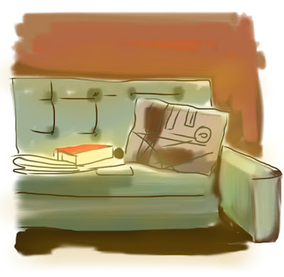
I want my iPad to be a Universal Sketchbook, something on which I can do everything from precise ink-style drawings to painting-like color sketches. My favorite art app so far is "Art Studio," which is built like Photoshop and can do quite a lot of the same things. Another good thing about the iPad as sketchbook is that it is lit up while it works, so you can sit in a dim place and still do a drawing. I sat in my friend's very tasteful mid-century modern living room and sketched her couch, as well as her geometric abstraction pillow and her newspaper and book. I am hoping to get more and more precise with this technique so that I can do anything from fake "plein air" to highly realistic renderings.

Monday, July 18, 2011

Two Michaelines


I'm back from the annual meeting of my religious group, the "Order of St. Michael." We had a good time praying, doing liturgy, discussing interesting topics, and just being friends in one place together. Most of the time we only connect online, because we are a very modern type of religious order. We have both females and males, married or single, and a wide diversity of lifestyles and occupations. Our "habit" is a dark blue robe that we wear at meetings. You see two of them here, as I sketched them after a religious service, color added later in Photoshop. It was good to spend a weekend with friends in a park-like environment, a convent-run retreat house near Reading, Pennsylvania. Many thanks to the Sisters who hosted us.

Thursday, July 14, 2011

Dulles Airport design


The main terminal at Dulles Airport, designed by Eero Saarinen and built from 1958 to 1962, is a masterpiece of mid-century modern design. Even the utilitarian back areas, housing offices, storerooms, and other non-passenger stuff, follow the sweeping, angled planes of Saarinen's concept. I drew this while waiting for a friend to arrive on a delayed flight. Airport workers taking their breaks watched me draw with fascination.

Sketchbook page, Pitt black pen, about 9" x 5", July 13, 2011.

There won't be any new By-products for the next few days as I am at a conference this weekend. Thank you for your support.

Wednesday, July 13, 2011

Manhattan Bagels Gone


Here's a page from my 1999 sketchbook. In those days, there was a "Manhattan Bagel" shop in a shopping center within walking distance of the place where I still live. It is long gone, its storefront now occupied by a cheap cell phone store or something equally dull. I used to hang out there and drink coffee and eat bagels almost every day. I drew this picture in February of 1999.

I have just heard that the famous "H & H Bagels" store on 80th Street in New York City has closed. Gourmets hated these bagels as "inauthentic" or oversized or too sweet or whatever but I loved them and remember eating them in my rare visits to New York. They were one of my favorite things to eat and in my ignorant opinion no other bagel came close. Here in the DC area there are of course bagel shops, including not only Manhattan Bagel but "Chesapeake Bagel Bakery" and I have tried to find a decent bagel there but no luck.

As you know if you are a reader of this Blog, I work at a bagel shop doing signs, that is for Mena's "Bagels, Deli, and Donuts" which is not one of a chain but a unique establishment. Usually by the time I arrive in mid-afternoon to do the sign work, her bagels are mostly gone, bought up by hungry patrons. The ones that are left are no longer in pristine condition, since the Bagel is a fleeting delicacy. Mena won't tell me where the bagels come from but I suspect that she imports the pre-made dough and then bakes them at the store in the pre-dawn hours. For all I know, Mena's bagels might be made in New York. It's one of those food secrets I'd rather not know.

Sketchbook page is black technical pen, 7" x 10", February 15, 1999. Click on the pic for a larger view, including part of a shop employee at the right edge.

Tuesday, July 12, 2011

Roman Emperor portrait miniature


Science fiction and fantasy fans are often major history researchers too. They will spend years of their time finding out about various Roman and medieval era cultures, wars, costumes, weaponry, politics, etc. Many of them identify with a historical time period and often acquire or make garb to match it. The Society for Creative Anachronism is only one of countless re-enactment groups for whatever time of human history you can think of.

David was a Roman Empire fan and he asked that he be portrayed as a Roman Emperor on his nametag miniature. He wasn't about to play the part of an Emperor in a re-enactment, but at least he could be Imperial on a very...small...scale. He looks much younger than he really was at the time, as if he were one of those decadent boy emperors of the turbulent Middle or Later Empire. Looking back, I am fond of the ink-and-watercolor style I used in this picture and in other miniatures, and I wonder whether I could re-create it, perhaps even in a digital simulation. I used to call it my "storybook style," as it resembled illustrations for children's books done in the late 19th or early 20th century.

Emperor David is ink and watercolor on Fabriano paper, 2 1/4" x 3 1/2", February 1981.

Monday, July 11, 2011

Vikings miniature


Here's another archaeological find and restoration from my slide archive. "Michael Le-Sear" was the "Society for Creative Anachronism" name identity of the guy who commissioned this namebadge from me. He was a Navy veteran and wanted a nautical theme, preferably Vikings. So I did this scene for him, Viking ships with the blue line of the New World's land at their horizon. The thing at the left of the name didn't come out well in the photograph; it is a carved dragon prow. There's a lot of space incorporated in this teeny weeny piece. I enjoyed making these tiny compositions full of detail, and I especially enjoyed adding lettering. The original is now long-lost to the winds of time.

Viking nametag miniature is 3 1/2" x 2 1/4," ink and watercolor on Fabriano paper, spring 1982.

Sunday, July 10, 2011

Vino Village


My architectural portrait was received enthusiastically by the folks at Village Winery. It went right up on the wall near the tasting bar, and I got a box of Village output, including four bottles of their delicious Apple Wine. The owner invited me to have a show there, possibly in the fall at the beginning of the holiday season.

Meanwhile, I sat outdoors on their wine patio and did these sketches to continue my vineyard art series. Colored pencil and Pitt brown technical pen, as usual.

Saturday, July 9, 2011

Village Winery Rustic Paradise


Of all the wineries I've visited in the last couple of years, Village Winery in historic Waterford, Virginia has one of the best buildings and grounds. It's a rustic paradise with a patio and meadows, views of peaceful vines and orchards, and a simple wooden tasting shed. When I showed the owners my drawing that I did on their site, they asked whether I could do a portrait of their building and wine sipping area, for publicity display on their wall. Certainly I could, and here it is. The wineglass in the front contains one of the Village specialties, apple wine, hence the apple next to the glass. This apple wine is joyous nectar and if my art is accepted by the wine folks, I will receive a case of their products, which include not only conventional grape wines but apple and elderberry wines as well.

"Village Winery" is watercolor on heavy paper, 17" x 13", July 2011. Click on the picture for a somewhat larger view.

Friday, July 8, 2011

Awakening the Life Force


Llewellyn Books has been the introduction to esotericism for many an aspirant. Their books are usually colorfully presented and easy to read, with pretty interior illustrations as well. I got a commission to do a cover for this book on Yoga by an Indian yoga expert named Swami Rajarshi Muni, who is still alive and involved with Yoga teaching. I was given a design to work from, of a girl in the lotus position showing the esoteric energy conduits which went up the torso and spine, directed from what looks like a prostate gland (?) in her groin just above her ankle. I added the colorful "chakra" symbols in a stained-glass style.

I didn't read the book, which was published more than a year after I did the artwork. When I finally did get my copy of the book after publication, I found it unusually technical, full of elaborate Hindu doctrine and philosophy, and not at all simple for a beginner yogi to follow.

"Awakening the Life Force" cover is watercolor on illustration board, 14" x 20", January 1993. Writing, title type, etc. was added by the Llewellyn designers. Click on the picture for a larger view.

Thursday, July 7, 2011

Danilo of Darkover miniature


I rescued Danilo from the obscurity of a poor photograph from 1982. Thirty years ago (!) most of us had no idea that such a thing as Photoshop's digital restoration would be possible. Danilo was a much-loved Darkover character who appeared in a number of M.Z. Bradley's tales as well as in endless reams of fan fiction. He was the gay partner of the noble and heroic Regis Hastur, hero of the Bradley book THE HERITAGE OF HASTUR. Thirty years ago it was far more unacceptable to be openly gay, even in the fantasy fan community which claimed to welcome diverse sorts of people. Danilo and his lover Regis became symbols of the struggle of homosexuals to gain their rightful place in society free of prejudice and bullying. This miniature portrait, done in a Renaissance style, was made for a Darkover fan who, whether gay or straight, simply liked the character.

Danilo nametag miniature is ink and watercolor on Fabriano paper, 2 1/4" x 3 1/2", February 1982.

Wednesday, July 6, 2011

Bronze Dragon Miniature


In 1980 I won an art contest illustrating a then-recent story by Anne McCaffrey about her dragonworld of Pern. The prize was a trip to Ireland to meet Ms. McCaffrey and tour around. I did this in October of 1980, traveling with a friend. We visited McCaffrey's home outside of Dublin, and met her family and pets. On the walls of her home were paintings and drawings inspired by her tales of the dragon-riders. There was one portrait of a rearing dragon that she said was the closest any artist had come to depicting what her dragons looked like. I was surprised, because it was not reptilian and graceful like most "classic" dragons, but massive and plump, with wings that were much too small for a creature that size to fly with.

I asked her how these dragons were supposed to fly with those little wings, and she said with a smile, "They LEVITATE." Magic, perhaps, though that wasn't mentioned in the stories. Or perhaps they flew like bumblebees, with that famous "impossibility" technique that turned out not to be so impossible with a flexible wing. Anyway, the Dragons of Pern were not your typical dragon, though they would easily be recognized as "dragons." This nametag miniature shows a bronze dragon done according to the image I saw at the McCaffrey home, complete with giraffe-like tubular "ears."

I did this nametag miniature as a blank to be sold at convention, and later someone named "Lyn" bought it and had me inscribe her "Pernese" fan name variant, "J'Lyn," on the card. Unlike Darkover fandom, which dwindled away after the death of the author Marion Zimmer Bradley, Pern fans still exist and enjoy new stories written not only by the matriarchal 85-year-old McCaffrey but by her son Todd as well.

"Bronze Wings" nametag miniature is 3 1/2" x 2 1/4," ink and watercolor on Fabriano paper, summer 1981.

Tuesday, July 5, 2011

Volcano of Light


I viewed the fireworks display at the Washington Monument from far away, on a high slope in Arlington, VA. The highly concentrated bursts of light looked like a volcanic eruption, especially since red, yellow, and orange dominated the color scheme. A small crowd of onlookers enjoyed the sight, framed by nearby trees. And so America's Night of Light took place for this year. And tonight I heard the first katydids in the trees.

Photoshop sketch from memory, 10" x 7", July 5, 2011.

Monday, July 4, 2011

The Delaware Druid


Here's another fantasy portrait of a real person. I have known this gentleman for more than thirty years, though since he lives relatively far away from me in Delaware, I don't get to meet with him. He is a leader in the Neo-Pagan religious movement and has helped give this modern re-creation some intellectual depth. Two major religions originated in the nineteenth century CE: Baha'i and Mormonism. The twentieth century gave us Neo-paganism in its many different forms. Modern Pagans, though they originally claimed to be reviving the authentic practices of pre-Christian antiquity, now admit that their practices are new, invented, and adapted to modern life. There is a mythic element to this religious movement which makes it attractive to science fiction and fantasy fans as well as computer programmers and engineers. Without a single authoritative Scripture (such as the Bible or the Koran), Neo-Pagans work out their own theology, stories, and rituals. Though I am not a Pagan, I've been happy to help my Pagan friends all along and hope to continue doing so through my art.

The "Delaware Druid" is acrylic on illustration board, 9" x 11", November 1986.

Sunday, July 3, 2011

Fabbioli in the sun


The summer sun was bright and the meadows were dry at Fabbioli Cellars, my destination winery for "Wine Saturday." I tasted a set of excellent wines and picked out their new white, "Something White," for my drawing sip. I really enjoy the soft texture of Fabbioli wines, especially their Cabernet Franc Reserve. I don't like wines that are biting and bitter. I don't know how to say that in "wine language" but as I spend more time in Wineworld I will learn what to say.

Fabbioli sketch is Pitt brown technical pen and colored pencil, about 8" x 7", July 2, 2011.

Saturday, July 2, 2011

Ford Fender


It was "First Friday" in Falls Church, which means that there was entertainment, vendors, and old cars in the "Art and Frame" parking lot. I sketched the shiny fender and open hood of a 1933-1934 Ford on display, with the bandstand and the noisy band in the background. This was done on my iPad, which got a lot of attention. I am learning how to sketch on it but I am certainly not proficient yet. And I inadvertently deleted a drawing because I didn't realize how the filing process went. As always, more practice is necessary.

Drawn on the iPad, "Art Studio" app, original size about 14" x 10", July 1, 2011.

Friday, July 1, 2011

Ambient Album Cover


Kirill Platonkin is an ambient music composer who lives in far-off eastern Russia, in a town called Blagoveshchensk. The town is on the Chinese border, paired with a Chinese town called Heihe. In this remote reach, the Internet brings the world to Russia's Amur Oblast and vice versa. Platonkin's music combines electronic drones and textures, and field recordings. As a member of the Stillstream online music community, Platonkin asked me to do a cover for his latest release. I have already done a number of CD covers for Stillstream musicians.

On this cover, I asked Platonkin for a photograph of "Lenin Street," where he made some field recordings that were used on a track in the album. I was surprised that Blagoveshchensk looked so European, at least that part of it. I listened to the music and tried to match the mood and title to the illustration, using a heavily Photoshop-modified version of the Lenin Street photograph. The idea was to re-create the environment as a waking dream, populated by pale bluish shadows, that fades into light, much like the trance-fostering electronic drones in Platonkin's album.

CD cover is Photoshop, 4.80" x 4.80", June 2011.