Thursday, December 31, 2009

Lights of the World Wide Web


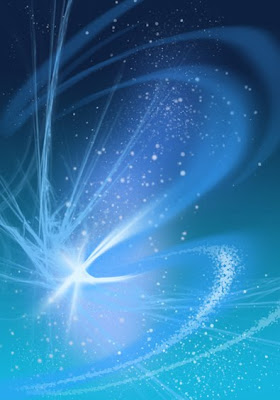
The "World Wide Web" had not yet been invented when I painted this picture. I didn't have a computer, though I had played with one or two which belonged to friends. I was freezing in Cambridge, Massachusetts and was working at a New Age Christian bookstore, surrounded by people even wackier than I was. The title of this star and nebula picture is "Lights of the World," vaguely inspired by the Grateful Dead song title "Eyes of the World," and by the Christian notion that Jesus is the light of the world.

During the 1980s I made a number of not very successful attempts to paint Christian-themed space pictures. I am not sure whether I would be more successful trying it now. Can Photoshoppery and Christianity co-exist? I don't talk about my religious life much, it invites too much hostility and angry or more often condescending comments. ("Whatever turns you on, whatever makes you feel better..." etc.) Every so often I add some bit of hidden or even obvious religious symbolism into my paintings. But maybe the religious world in this Age of Fundamentalist Terror is too dangerous to explore. So it's just a picture of a nebula with stars.

"Lights of the World," acrylic on illustration board, 10" x 7", February 1988

Wednesday, December 30, 2009

Emperor and Hierophant


Here's another pair from my "CorelDraw Tarot." These are the symbols of masculine power and leadership: the Emperor and the Hierophant, or High Priest...or Pope. My view of the Emperor puts him in a business suit and tie, rather than old-style imperial regalia. The "ankh," the ancient Egyptian sign for eternal life found on more traditional Tarot versions, becomes his lapel insignia. The High Priest holds the symbol of imperial religion, a Holy Book with ruling laws and scriptures.

From my "CorelDraw Tarot," digital compositions from 1991-92.

Tuesday, December 29, 2009

Nebular Dawn Wind


When a new star forms and really gets going, the "pressure" of its radiance pouring forth particles forms a cosmic analogue to wind. This wind acts on the nebular gases which have up until now shrouded the new star in a cloudy cocoon. The bright new star blows away the gases around it, leaving a relatively empty space where it has cleared out the nebular material. In this illustration, a new star not only illuminates its surrounding nebula with reflected light but is causing filaments of gas to fluoresce, thus providing the would-be observer with a shining dawnscape.

The original painting of this had no glowing filaments of gas. I added them in using my newly updated Photoshop CS4. The newest photographs from the Hubble Space Telescope reveal complex networks of gas and dust within nebulae which up until a few years ago were only diffuse glows in a telescope view.

"Nebular Dawn" is acrylic on illustration board, 7" x 10", February 1988. More detail added in Photoshop, December 2009.

Monday, December 28, 2009

German Bubbly


I haven't posted anything from Trader Joe's in a while so here's an end-cap (large "billboard" behind a big display of something). As always at the end of the year, TJ's offers bubbly wines for all budgets, so everyone who wants to can toast the new year. Only stuff from Champagne, France can be truly called "champagne," and that's expensive. Other countries have other names for similar beverages, just as tasty but far cheaper. German bubbly wine of this type is called "Sekt." I added ribbons in the red and yellow colors of the German flag, with white confetti on the bottom. 2009's almost out of here, and not too many people I know will miss it. Drink up!

Sunday, December 27, 2009

Gaslights


Another space picture, airbrush and hand brushwork on my usual black background. The title, "Gaslights," refers to the shining gas of an emission nebula. I sent this piece to "Conclave," a convention in Ann Arbor, Michigan, where it won a prize in the Amateur division. I forgot to tell them that I was a professional.

"Gaslights," acrylic on illustration board, 10" x 7", October 1987

Saturday, December 26, 2009

Friendly Interior


I spent the day at some friends' house, eating many good things and drinking wine. Just right for a dripping, icy rainy wet winter's day. There was an indoor and an outdoor fireplace. I sat by the fire and drew this sketch of their home interior. People went here and there but I didn't put them in the drawing. Food was abundant and I took home some leftovers.

Drawing is ink on sketchbook paper, about 8" x 8".

Friday, December 25, 2009

Glacial Drifts in the Parking Lot


I searched through my archives for something reverent and pretty to put up here for Christmas, and found nothing that I felt was just right. Nor did I want to concoct some tacky toss-off in Photoshop. So here's today's drawing, or what a white Christmas looks like here in the DC area. Great big heaps of crumbly snow are everywhere, pushed up into dirty drifts by the plows. Many parking spaces are lost under these heaps while people frantically try to find a place to put their enormous SUV's and vans. I was one of those consumers myself. I took the time to make this sketch while sitting on the tailgate of my not-so-enormous van. The people were vicious today. It is one of the ironies of this whole holiday period that it brings out the worst in people, when it is supposed to bring out the best. I might ask what is wrong, but there is no simple answer and I'm not going to volunteer my thoughts about it. I wish you all a very happy Christmas holiday, or at least a winter weekend without too much torment.

Thursday, December 24, 2009

Three Blue Stars Rise on the Hill


Here I am again with star-forming nebulas and space gravel. There's a lot of crunchy stuff floating around in space, not big enough to be asteroids. It's left over from blown-up stars. It's kind of like demolition debris that might be re-used in building new stars.

In the later years of the '80s I was a fan of the Grateful Dead and went to some concerts. I never got into the smoky lifestyle or the hippie culture. But I liked the songs and the words. One song, "Built to Last," has a line: "Three Blue Stars/Rise on a hill." I have no idea what the lyrics mean, but it sounds good and here are the three blue stars, freshly formed from the remains of the Dead.

"Crosswinds," acrylic on illustration board, 7" x 10", February 1988.

Wednesday, December 23, 2009

Fire and Air


Here are two more of the "Four Elements and Spirit" series, which I saved from media oblivion. You can see how I worked in the geometric symbol for each element, the red triangle for Fire and the blue circle of Air. I like these images because the constraints of the early computer design program and limited computer power made me keep things simple. You will notice that the typeface on "Fire" is somewhat different from the original typeface which you see on "Air." That is because in rescuing the file as a mac.pict format, the old typeface dropped out and was no longer available. I replaced it with the most similar one I could find in my current font collection.

Are you a "fire," "air," "earth," or "water" person? Sounds like one of those dumb Facebook quizzes, but in esotericism it is a meaningful question. Not only do our personalities resonate with different mythic elements, our world's phenomena can be described mythically by combinations of two symbols. For instance, "water in air" is clouds and rain, "fire in earth" is volcanic magma, "water in earth" is underground springs or the water table, and "earth in air" is windblown dust or ash. Thinking with visual quasi-religious symbols, while completely unscientific, is a way to mythologize the physical world and give it meaning.

After three years of not doing much, I am back doing mathematics and I hope to return to my basic physics studies as well. I am considering re-starting my old math and physics and philosophical blog, ELECTRON BLUE, to write about things which aren't about visual art, which goes here. Or perhaps, should I write about my math and physics studies here too? I don't want to bore my little crew of readers. If I re-started the Electron, it would be a Blogspot blog as a companion to this one, with a link in case you were interested. Any comments would be welcome.

Tuesday, December 22, 2009

Earth and Water


I got my first computer in 1991, and by 1992 I was doing a lot of digital art in CorelDraw. I wouldn't call this early work of mine "cutting edge," since by that time other artists were already doing much more sophisticated work in computer generated images (CGI). But this type of abstract flat or simply blended color fit in (and still does) with what I was trying to portray. It is a mix of graphic design and "fine arts."

At that point I was doing a lot of study in Western esotericism and its visual symbolism. The creators of magical systems such as the "Golden Dawn" appropriated symbols for elements not only from Western alchemy but from Buddhist and Hindu iconography. The four ancient classical elements are a big part of Western Esotericism and are often symbolized by three primary colors and one other color, or by basic easily memorized shapes. The Elements in the Golden Dawn system were symbolized by Earth as a yellow square, Water as a silver crescent, Fire as a red triangle, and Air as a blue circle.

As with the CorelDraw Tarot, I created "card"-like representations of the four classical Elements as well as "Spirit," which was created to be the "quintessence" or the transcendent element. The image incorporates the esoteric symbol for the element, Earth's yellow square and Water's silver crescent. The landscape of Earth was inspired by the hills of East Tennessee during winter, when they are brown except for evergreens and the ever-present eastern red cedar trees (portrayed here) which grow by the roadside or in fields. "Water" was inspired by seaweed and bubbles.

"The Four Elements and Spirit," CorelDraw, February 1992.

Monday, December 21, 2009

Star Wave


You can't go wrong with blue. Since the colors in nebula art are always sort of arbitrary, why not go with the one that gives you the serene mood you want? This one is called "Star Wave," meant to suggest a cosmic ocean of gas and stars. There's no reason why the curling forms of ocean water wouldn't also occur in space, as long as there are similar forces creating them. This nebula is also hosting fresh new stars.

And meanwhile, a happy Winter Solstice to all my friends and readers in the Northern Hemisphere! The days are now getting longer.

"Star Wave," acrylic on illustration board, 12" x 8", January 1988.

Sunday, December 20, 2009

Saving the CorelDraw Tarot


Today while the snow piled up into car-swallowing drifts, I saved some of my best art from oblivion. This will be a rather geeky post so ignore it if you wish. You recall that I posted some primitive prints of two of my "CorelDraw Tarot" major arcana cards, some weeks ago. I lamented at the time that the original CorelDraw files of the Tarot were lost, because they were inaccessible to modern media and even the newer versions of CorelDraw couldn't handle them. Well, today I was able to save these pieces into a more or less modern and usable format.

I did it thanks to my tendency to archive everything, and the flexibility of Windows XP. The CorelDraw Tarot was done in 1991-92, on CorelDraw 3. I am now running CorelDraw 12 on my PC laptop with XP. CorelDraw is now up to number 14, called by them "X4," but 12 is good enough for me. But 12 wouldn't bring up most of the files. So I decided as an experiment to find the original CD for CorelDraw 3, which I still have after 18 years. And having found it, I popped it into the machine and tried to install it. That's right, re-living 1991. I wasn't sure it would work, but there it was, in its grey-box simplicity. It didn't do everything it used to, but I was able to call up the old files on their old software, and all I needed to do to upgrade them was to find the proper font (in this case, Corel's version of "Friz Quadrata" known as "Franco") to restore the card images to their original appearance.

Then there was the problem of what format to save them to. No graphics software I have used (Adobe, GIMP, Photoshop, etc.) will read CorelDraw (.cdr) files, except CorelDraw itself. I could export some of these pieces to JPEG by transferring them to CorelDraw 12, which was running simultaneously with CorelDraw 3 (I love my little PC). Other images in the series wouldn't work. So in the options for formats to save to in CorelDraw 3, I found "Mac Pict." This is an ancient format used for early Macintoshes, which is irrelevant for most modern Macs but kept around for "legacy" files such as my Tarot. Well, I have two smug Macs just waiting to tell me how they wouldn't use PC formats. So I saved these files to Mac Pict and hoped that they would work on the iMac and lo and behold they did. I can open them in Photoshop.

Once in the clutches of Photoshop, the Tarot shines forth again. The JPEGs tend to be duller in colors and a bit blurry, but the blends are smoother. The Mac Pict format pieces are brighter, but the blends are uneven (as they were in CorelDraw back in the old days). No matter that, I have my CorelDraw Tarot back in living memory. I also saved some other digital winners from 1991 and 1992. Who needs Adobe? It's too damn bad that Adobe Illustrator/Photoshop became the graphics industry standard. I personally think that CorelDraw/Photopaint was the better program.

Saturday, December 19, 2009

Instant Pretty


It's kind of ridiculous, really. Creating something this pretty in Photoshop is like the proverbial "shooting fish in a barrel." You've got your gradients, your smooth blends, your sprinkling stars, your starbursts, and your energy whirls, all at your stylus-tip. Doing this with an airbrush and a paintbrush would take hours, if not days. Much of that time would be spent waiting for this or that layer to dry. Pixels don't need to dry. This took fifteen minutes. The only thing this needs to make it better is a beautiful naked female, lounging in zero-G. Space is full of them.

I am inspired to make this by the lavish volume I am currently reading and absorbing for photoshop mastery. This is "Utherworlds" by the designer and artist Philip Straub. It's a text and picture (and I believe there's also a soundtrack!) extravaganza, published by the fabulous "Ballistic" art publishing house. The artwork is wildly surrealistic (though the requisite naked women appear) and the text is inscribed in a tiny, hard-to-read handwritten font on "ancient parchment" textures. The story is about an Earthman who somehow is transported to a dreamworld similar to any number of neo-Zoroastrian fantasy worlds where the forces of Good, who live in "balance" and "harmony" with Nature, are attacked and damaged by the forces of Evil, who live in big megacities and love technology and money. He meets a beautiful, scantily clad woman who takes him on a tour of the world while the bad guys pursue them. The Good folk are color-themed in blue, white, and lavender, and the Evil guys and cities are in nasty armor of black, red, and lava orange. It's all done digitally with photographic texture and naked or lightly draped female models folded in.

I'm thinking, I can do this. Don't I have an imaginary world? There must be naked Noantri women somewhere. I've got volcanic eruptions, cool vehicles, and techno-gangsters too. I could totally do this. The good and evil, harmony and balance part, that's a bit more difficult. Let me get back to you as soon as I get my upgrade, so that my Photoshop doesn't seize and revert to default on me as it often does.

Friday, December 18, 2009

Three Travelers


This image isn't the best-preserved in my archives, but it's colorful. I titled it "The Three Travelers" and showed it at a Balticon (Baltimore's annual science fiction convention) in 1987. This is the kind of space picture that's good for entertainment only; it contains no educational message about space nor is it accurate in its depiction of a nebula or possible real space ships. Science fiction has changed in the last twenty years. It seems to me that it's less about scientific speculation and tales of space and more about alternate universe nostalgia. The findings of current science seem to point away from making real any of the interstellar adventures that old-style science fiction celebrated. But alternate universe nostalgia's fine with me.

"The Three Travelers" is acrylic on illustration board, 7" x 10, April 1987.

Thursday, December 17, 2009

Noantri: Not X-actly the X-Men


Friends and "fans" of mine will remember that I have an imaginary world which I have illustrated and written about for most of my life. The "Noantri" are a grey-haired people who came through a stargate to settle an alternate, pre-historic Earth where humans had not yet evolved. Most Noantri have some degree of psychic powers, and some rare Noantri have a cosmically high level of psi ability, which needs lots of training and practice to master or even live with. They're not mutants, and they're not super-heroes in costume, either. They perform various services for (or against) society.

Here's an international group of seven of these gifted types, in their accustomed native garb. They are five men and two women, the ladies being Ariadne (second from left) and Miraqatna (second from right.). These are all based at an institute for psychic studies, where they teach or learn to use their powers wisely. The leader and master adept is Tanheu, the little guy in black in the center. (See my Art By-Products entry for January 17, 2009.) The colorful glows around their heads are an artistic convention to note the color of their psychic aura. These characters, along with others, may appear in my future illustrations and sequential art. Another psi-adept from this world, the architect Mereth Kahn, was the subject of my architectural series here in January and February, earlier this year.

Ink drawing, colored in Photoshop, about 8" x 5". Click on the image for somewhat larger version.

Wednesday, December 16, 2009

Traffic at the Stargate


This image finally got to be a cover - in Germany. It was originally called "Traffic at the Stargate," depicting ships going to and fro in a science-fictional tunnel to somewhere. As with the "City of Revelations" picture, it was later picked up by a German publisher for a cover overseas. The image ended up on an s.f. pulp magazine cover, illustrating a story called, in an enigmatic mix of German and English, "Das Ende der Point Of." The end of "Point Of?" Huh? Well, it got published and that's what counts.

"Traffic at the Stargate," acrylic on illustration board, 16" x 20", February 1987.

Tuesday, December 15, 2009

Algorithm 2


My friend Tristan hates these digitally colored doodles of mine, but they serve an important purpose for me. I get to try out more geometric abstractions in miniature form, coloring them in with a medium that allows me not only to do it in seconds, but to change it at will.

My geometric abstractions are designed by means of a formula, an algorithm. This is a step-by-step progressive instruction on how to build something. It's like a recipe. In this case, this is "Algorithm 2" of my set of formulas on how to build one of these designs. Algorithm 2 says, "Bounce straight lines off the inner edges of a polygon, somewhat at random, until you have enough shapes to work with. Then color them in. Don't use curved lines." That ought to do it. There should be endless numbers of these algorithms to invent, which will stave off abstract boredom, at least for a while.

Original is a tiny ink drawing about 3.25" x 2.25", colored in Photoshop.

Monday, December 14, 2009

Smashup Saucers


Tilted horizon, flying saucers, bursts of plasma weapons, megastructure technology...I tried every science fiction art cliche, but this never got chosen for a book cover. I was imitating British book covers of the time, which I thought were better illustrated than the American ones. And also, of course, Star Wars, which you could imitate forever and still make mediocre art. They're still doing stuff like this now, for video games, but it's all digitally rendered.

"Megastructure Melee," acrylic on illustration board, 14" x 18", February 1987.

Sunday, December 13, 2009

Fool and Magician


Skipping a few years ahead to 1991, I had moved to the Washington DC area and acquired my first computer and color printer. The computer was cobbled together from various collected parts by a rather dodgy tech friend of mine. But it could run graphics software and that's what counted for me. When I saw what CorelDraw 2 could do, I was thrilled. I had been working with cut-paper designs for a while, and liked images made of flat or simply-blended color shapes. But the cut paper was difficult to work with, and was also fragile and easily marked and bent. CorelDraw could do these shapes electronically, with no razor cutting, glue, or frayed edges.

I needed to have a printer to bring these designs to the "real" world and make them show-able. I spent a lot of money looking for professional shops which would do the job. But in 1991 color laser printing was just at its beginning and the prints from my files were poorly colored and overly textured. The first color printer that I bought for my studio was an inkjet, an HP PaintJet. It delivered bright color prints which for their time were quite good, though they were not at all smooth color blends. The HP PaintJet mixed dots in patterns to get blends, and images came out looking like they had been woven on a loom. (See above images, click for larger image, for the textures.) Not only that, but the bright PaintJet colors, even on coated paper, faded very fast, so fast that even one hour of sun exposure would bleach it out. Therefore to get a durable print, I had to take the PaintJet prints to the laser copying station at Kinkos Copies, where the most advanced machines were installed. This was expensive, but it worked.

One of my first projects using CorelDraw 2 was the Major Arcana of the Tarot. This was to be tied in with what might be called "neo-Kabbalah," or the non-Jewish, 19th century re-interpretation of the Kabbalah. The symbolism came from the traditional Tarot, and the color scheme for the cards is based on the Neo-Kabbalistic idea that each card symbolically links together two stations on the Kabbalistic Tree of Life (which resembles an esoteric flow-chart of the Universe.). Since each station has a color, each card features two colors (and only two) in combination. I had originally started this project using cut paper, but it was already falling apart.

The original name for my Tarot was the "Post-Modern Tarot" because I would be interpreting many of the Major Arcana for our modern age. For the other cards, I tried to make the symbol as simple as possible, as in these two.

I'm now scanning the last extant set of these cards printed on the ancient and long-gone PaintJet. These were kept away from light for all these years. The original CorelDraw files are unretrievable, as many of their symbols and shapes are from fonts which no longer exist. I will be leading you through the Post-Modern Major Arcana.

"Post-Modern Tarot" (later re-named the "CorelDraw Tarot"), Fool and Magician cards. Each 3 3/4" x 5 1/4", HP PaintJet prints, 1991-1992.

Saturday, December 12, 2009

Cybercity of Revelations


The covers I did for TELECOMMUNICATIONS inspired this picture, along with images from the movie TRON. The influence was there, even though I had never seen the movie, only still images from it. Its title is CITY OF REVELATIONS, which is the title of a book about pseudo-scientific religious legends, including Biblical Revelations.

I had done a small version of this some weeks earlier, to try out the paint-by-ruler technique and airbrush bursts. I went ahead on the larger one and showed it at Boskone, Boston's annual science fiction convention. It was bought by a longtime collector friend of mine, and whenever I visit him in his Cambridge quarters, there it is on the wall.

This image was later used as the cover for the German edition of Bruce Sterling's SCHISMATRIX. In those days German publishers used to buy one-time rights from American artists for book covers. They would print from ordinary 35 mm slides.

CITY OF REVELATIONS is acrylic on black-coated illustration board, 13" x 22", January 1987.

Friday, December 11, 2009

Architecture Digital Rendering


I'm thinking about what artistic and learning projects I want for 2010. Some things will go back on the shelf, others will continue, and I may do something new. One thing I am very committed to is advancing my rendering and illustration skills in Photoshop. I would eventually like to be able to do book cover, game and movie-style work in Photoshop as well as sequential art. I am hoping to upgrade to Adobe CS4 very soon.

This piece was done without a prior pencil drawing scanned in. I created it from Wacom tablet scratch in Photoshop. This architectural detail, a smallish watchtower in a castle-like complex, has a "post-modernish" feel to it. Maybe a bit of homage to neoclassical architect Robert A.M. Stern.

If any of you handful of faithful viewers are interested in seeing more of something art-wise from me, I invite you to speak up in the comments.

Thursday, December 10, 2009

Optical Switching Mandala


Faithful readers of this Blog (at least 5 people) might remember my first cover for "Telecommunications" magazine, in which I depicted a symbolic landscape of networked machines in a smoggy California sunset. This piece is my second cover for that magazine, painted in November 1986. It was created from the art director's assignment to depict a network of fiber optic lines and switches. The sparkles in the picture represent the switches. The squares in the background were inspired by the paintings of Josef Albers, who painted the experimental color series "Homage to the Square." The magazine logo and article titles went over the empty upper part of the picture. The pattern here also is reminiscent of a mandala, a centralized prayer image from Hinduism or Buddhism.

This image of the piece was taken under flash light indoors, so some color richness has been lost. The background, painted in airbrush, was really dark purple. For the blog image, I've added some of the purple back in Photoshop. Even in 1986, it was possible to do this pattern using digital media. It was at the very beginning of commercial digital art. But I wouldn't start using digital media until 1991. Unfortunately, I didn't get any more covers for the magazine, which disappeared a couple of years later.

"Optical Switching Mandala," 13" x 15". Acrylic on heavy Bristol board, November 1986, published December 1986.

Wednesday, December 9, 2009

Starbucks Winter Design


Biomorphic steampunkish gear designs decorate my Winter design for Starbucks in McLean, Virginia. This is the only Starbucks whose coffee board I currently decorate. The corporation does not want non-employees to do any decoration work there, but my friend the manager there allows me to do it anyway. The center is empty here, but in the store it advertises the featured winter drinks. I don't get paid in money, but I get paid in Starbucks goods.
Design done, as usual, in acrylic markers, with some Photoshoppage added for clarity here.

Tuesday, December 8, 2009

Another Earth, but Quite Different


Among all the exotic or extreme exoplanets in the universe, or even in this galaxy, there must exist some which are so similar to our Earth as to be duplicates. Current technology can't detect them yet, but they are sure to be there. Blue, fresh, distant havens with air we could breathe, oceans we could swim in. This one in the picture is just like Earth except for two moons, and the bright blue nebula which makes the night glow softly. Would there be life on this planet, and what kind of life? Would it evolve into an intelligent civilization? They might live quite differently from us, programmed to co-operate under all circumstances and having no aggressive tendencies at all. Could life arise and evolve under a "nicer," non-violent paradigm? Perhaps the nebula emits radiation which nourishes the life forms without the need for "conventional" food, thus eliminating conflict over resources. The radiation might be deadly for us, though, should we ever visit that world.

I called this picture "Planet of Peace." Don't let them know about us here on Earth.

"Planet of Peace," acrylic on illustration board, 10" x 7", January 1987.

Monday, December 7, 2009

Back to Bluemont


Here I am back in Bluemont, at least artistically. This house is on the main road of Bluemont, Virginia, a beautiful tiny town in the foothills of the Appalachians. I took the reference photo for it when I went to the town-wide Bluemont Fair in September. But the house really didn't look like this. In reality, this Victorian edifice is in disrepair, and it was further disarrayed by haphazard attempts at restoring it. Using my architectural rendering skills, I have portrayed this house as it should be, if the repair job was perfect. I have also given the place a landscaping makeover. If you look at the first floor facing us, you see a lot of windows. These are where a part of what was once a wrap-around porch was turned into an enclosed sitting-room. I suppose a complete restoration would remove this and turn it back into a porch, but I'm leaving it there. I wouldn't mind living in this house, if the renovation job really could happen. I hope I can revisit Bluemont for real.

Ink and watercolor on illustration board, 8" x 10", December 2009.

Sunday, December 6, 2009

Alien Pattypans


What if we encountered intelligent, technological aliens, but they looked like - or even were - edible vegetables? Or perhaps just their spaceships looked like that. These alien vessels resemble pattypan squash. I'm sure that some science fiction writer has done a story with that turnaround-from-normal idea, that the humans EAT the alien visitors because they are delicious. But if they had spaceships, they probably would know how to defend themselves. I have always found squash disturbing. I think they are aliens anyway. And there I am working in a grocery store. Sorry, it's late at night/early morning even for me.

"Alien Pattypans," acrylic on illustration board, 7" x 10", January 1987.

Saturday, December 5, 2009

Busy at Starbucks


Waiting for my car to have its regular maintenance, I stopped by a Starbucks, sipped and munched, and drew this drawing. The Starbucks was packed with people on business or break or just meeting up. The alien-spaceship-looking objects above the coffee drinkers are light fixtures. Stylized flames at the right advertise Starbucks fancy coffee and merchandise. Location is Tysons Corner, Edge City, outside of Washington, DC.

Friday, December 4, 2009

Protostars


Here I am, back in space after the Darkovercon show is over. I'm a few light-years back in space/time, returning to transcribing my slide archives to digital files. This piece is called "Protostars." In the nebula, gas and dust clump together to form marshmallows, which then heat up and get toasty due to gravity pushing the gas together until the atoms collide. When the outward pressure from the heat of atomic collisions equals the inward pressure from gravity, then the warm blobs are ready to eat. There's something a little odd about my cosmology, but I can't quite stick to the point here.

"Protostars" is acrylic on illustration board, 10" x 7", January 1987.

Thursday, December 3, 2009

Procession of the Chair Towers


After the convention was over I stayed another day rather than drive home in the dark when I was tired. So I roamed about the deserted hotel looking for things to draw. I found these towers of piled-up chairs in the large auditorium room where our events had been. I sat and drew them, intrigued by their stacked forms, reminding me of a giraffe, or a centipede upright, or a parade of walking skyscrapers. But what I really want to know is, how did the hotel people get these stacked up so high? Did the more nimble workers crawl up the sides to place more chairs at the top? They are too heavy and unbalanced for people to lift to add more chairs from the bottom. So they must have had some sort of machine to do it, like a cherry-picker or something. But I never saw any such contraption. However, there must be a simple answer to this mystery.

Wednesday, December 2, 2009

Orange Puffy Boots for God


I wore these orange puffy boots at DarkoverCon during Friday afternoon and evening. I matched them with a blazing orange tunic and sash. Drawing is colored in Photoshop. DarkoverCon is one of the few places and times when I can indulge my love of putting on costumes. These boots were made by the "Rocket Dog" fun shoe company and are no longer available. They are for "apres-ski" wear though that situation ("apres-ski") won't ever apply to me. NO SNOW! As is my tradition, I switch my theme color to purple during December, which is the Catholic/Anglican time of "Advent" or the four weeks before Christmas. Catholic/Anglican priests wear purple vestments at services during this time. I am a Catholic Christian, but I don't do much devotional or service activity. At least I can show forth the colors.

Tuesday, December 1, 2009

Darkovercon Interior


As with the last 30 years, December begins with my return from DarkoverCon. This hotel, currently the Crowne Plaza in Timonium, Maryland, has been the setting for the convention since about 1988. It features an enormous atrium, with a slanting roof, an industrial space worthy of an old-time metal factory or airplane hangar. In the earlier days, there was a swimming pool in the atrium, which connected to another part of the pool outdoors. The whole space stank of chlorine from this pool. When the Crowne Plaza took the hotel over, they mercifully removed the pool and filled in the pit, leaving a vast flat plain on which anything, any event, can be staged. Here is a view of it from my second-floor room, which looked out on the interior. It's before the convention started, and the tables are already set up for the vendors, but there is not a soul in sight at 8 PM when I did this drawing.

DarkoverCon didn't have a lot of attendance this year. Every year it gets smaller. I would guess that not more than 150 people attended, at least for the whole weekend. Some people showed up only for one day. I didn't sell many pictures, and made only a small amount of money, not at all enough to cover my expenses. I sold "Plasma Flames," "Calatrava's Bridge," and "Meteor Wing," which you have seen earlier on this Weblog.

I had a good time anyway, enjoying meeting with friends I only see once or twice a year face to face. I held "Salon Pyracantha" and much wine was consumed. Now it's back to the holiday cookies at work, and the drawing board in the home studio.