Wednesday, February 29, 2012

Atlas Shrugs Forever


Back in the late 1970s I was re-introduced to Ayn Rand's work by some Harvard friends. In 1978, while trying to leave graduate school, I read Rand's famous blockbuster, "Atlas Shrugged." I was energized and thrilled by this book which everyone else but I and my libertarian friends thought was tacky and ridiculous. For me, Rand created a universe where I mattered, where I could decide to be a success, where I could stand up strong and proud in a world of technology and progress. In Randworld, competence and rational intelligence, daring and boundless energy were virtues, not mental problems. I wanted to be a Rand person, and in some ways I still do. I don't care whether it is a mind-cracked fantasy or not, nor that Rand's personal life had few of her own written virtues. And I'm sorry that some public figures use Rand for their own ideological crusades, either for or against the aforementioned ideals. The whole "virtue of selfishness" theme in Rand's work has been distorted and misunderstood, but I am not the person to explain it again and again.

I did a number of character portraits and illustrations for Rand's books, especially "Atlas." This one above is one of the better ones. It's painted in the "portrait montage" style that was used for big, multi-character books at that time. That style of cover is rarely if ever seen today, but I think it still works for Rand's 1959 epic. The painting is amateurish (I was, uh, an amateur) and the photograph is poor, but my ambitions were Randworthy.

"Atlas Shrugged Fantasy" is acrylic on illustration board, 10" x 12", summer 1978.

Tuesday, February 28, 2012

Queen of the Cats


You know I love cats. I love 'em and draw 'em and when I go over to houses where there are real cats, I make friends with them and listen to them purr. I cannot have a cat of my own because I am allergic to them, and I'm unwilling to care and pay for all the expenses of another living being in my home. So I play with "O.P.C." which stands for "Other People's Cats." Cats are to be worshipped, as they will tell you clearly. And they are also secular royalty too, to be obeyed. Here she is, the Queen of the Cats, wearing her crown made from a single perfect royal purple jewel. I adapted her from a cover illustration from a cat magazine, long ago.

Queen Cat portrait is ink, watercolor, and gouache on Fabriano paper, 4" x 5 1/2", November 1984.

Monday, February 27, 2012

Colors of the Past


This is one of the earliest pieces of my art that I've ever featured on this Weblog. It is from 1969 and is a mix-up of things belonging to Lizzie, my friend at the time, as well as a portrait of her. In those days I always had my sketchbook and a set of colored pencils with me (as I do nowadays, but with the futuristic iPad) and when I did my friend's portrait I added in renderings of her current possessions as a kind of "time capsule." Lizzie lived in New York City, our parents were good friends, and it was always exciting to go visit her family. In the summer of 1969 we even visited them on a European vacation. Lizzie went on to be a financial consultant with a family and children of her own, and as far as I know still lives in New York City.

This "time capsule" has been in my sketchbook collection ever since. From upper left, clockwise: a heart motif from somewhere, Lizzie's portrait, her lipstick (or lip gloss), her teddy bear, a pillow with a cartoony nude, a copy of "Modern Love" magazine, and two 45 RPM records including a Capitol Records release, identified by its familiar orange and yellow spiral. "Modern Love" was a type of girls' magazine that has completely disappeared. It featured racy sex stories about young women. The headline of that cover said "16 - I do the wildest things to boys!"

This "collage" was not typical of my work in the sketchbook. Most of the drawings in there are of superheroes, superhero costumes, attempts at comic book pages, and later in the book a whole lot of life model drawings from about 1970 through 1972. Nothing much changes here at Pyracantha Studios.

Lizzie from 1969 is colored pencil on sketchbook page, 8 1/2" x 11", summer 1969.

Sunday, February 26, 2012

Winter Wining at Rapahannock


My winter wine destination for "Wine Saturday" was Rapahannock Cellars, a winery near Front Royal, Virginia. It was a longer journey than I usually do for a wine day, but it was worth it. Every one of the wines on their tasting list had something good about it, and there were no clunkers in the bunch. I was on a quest for Chardonnay and I found what I was looking for. Their Chardonnay is missing the usual sourness and it has a nice sequence of flavors including plenty of soft and mellow oak. I bought a bottle to go with my next chicken dish or crockpot concoction. The tasting staff was very friendly and cheerful especially my humorous host "Andy."

After tasting I sat at their doorway and drew this scene looking through their windows, on my iPad. Many customers had never seen an iPad used for sketching and I got a lot of attention. Rapahannock has a beautiful hilly view of vines and trees and rocks from wherever you stand, and has a nicely done event and dining room as well with spacious windows. It looks good even in the winter and I want to come back when it is all leafy and viney and green.

My picture shows the leafless winter vines in their rows in front of the hillsides in afternoon light. Winter isn't really over; it was a cold and blustery day with sailing clouds and a stray snowflake or two.

Autodesk Sketchbook Pro, about an hour or so. Trees and twigs touched up in Photoshop after downloading to my main system. February 25, 2012.

Saturday, February 25, 2012

Sandwich Spring


More folk-art designs adorn my sign decor for "Saint Patrick's" and spring 2012 at Menna's bagel shop. There is no such thing as an "authentic" Celtic look at a deli. I put some shamrocks in at the bottom to remind people of the next monthly contrived holiday. After two years of continuous service, the black-painted framed chalkboard was looking kind of shabby so I re-surfaced it with black chalkboard paint. It looks nice and fresh now, but I'm not sure how long it will last. It's kind of amazing to me that I've done signs for Menna and her store since 2007, almost 5 years. That's a lot of bagels and sandwiches.

Friday, February 24, 2012

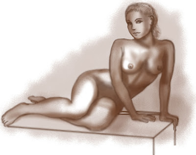
Figure Base Monochrome


This model girl looks dark because the drawing is a monochrome base layer on top of which I will paint rosy and flesh tones. Actually the model has quite a tan so I am going to lighten her skin up for this study. I am constantly experimenting with the best or most adaptable way to use Photoshop to render skin tone and texture, without looking too much like a photograph. I want to make sure that I get the shape-defining dark and light areas right before I color her in. I will not put dragons in this picture. Stay tuned for digital flesh.

Photoshop, 10" x 8", started on February 23.

Thursday, February 23, 2012

Dragon Lizard Faces


I continue to draw lizard and dragon heads. I want them to be expressive. The one on the upper right is unusually humanoid and I think it might be a human being who was turned into a dragon. The eyes face front which doesn't happen with a lot of reptiles. I just bought a photographic field guide to North American reptiles and amphibians so I can look at the real creatures which so often morph into dragons in our imagination. There are some lizards such as iguanas and "bearded dragons" which already look like dragons, except for their short necks. All the work on dragons has been done by other people over the millennia. All I need to do is keep drawing and copying and drawing and hoping that a dragon will not devour me.

The above set are lizard and dragon heads, adapted lizard heads, ballpoint pen on a small sketchbook page, 6" x 6". February 22-23, 2012. I put the little sketchbook and pen on the kitchen table so I can draw there whenever I want to.

Wednesday, February 22, 2012

Your Dollar Goes Farther


Your dollar goes farther...or is it further? I can't figure that one out. The dictionary and style guide says that "farther" is a measure of physical distance, while "further" is metaphorical. But in this case, the "farther" your dollar goes is not a real distance, other than the trip from your wallet to the cash register. It's metaphorical, so I suppose it should say, "Your dollar goes further..." but yet, I'm using a graphic of an antique car which really does go farther, if it were a real car and not a graphic, if you get what I'm trying to say. I am probably going to get comments on it from the highly educated customers, but if they say something, it means that they at least looked at my ad and didn't ignore it.

I did this piece today, ordered directly from the manager to me. The bottom empty area is for the name and price of the product. I haven't been doing much graphic work for Trader Joe's, they have been using me to run the cash register instead. But a new manager is about to arrive, so some things may change.

"Your Dollar" graphic is 8 1/4" x 6 1/8", markers on cardstock, February 21, 2012.

Tuesday, February 21, 2012

Memories of Killraven


As most of you know, I've always been a big comics fan, especially Marvel. In the 1970s and occasionally in later years, Marvel ran stories about a freedom-fighting hero in a post-apocalyptic Earth which had been conquered by aliens. He was "Killraven" and he was originally drawn by the wonderful P. Craig Russell. This is my rendition of the character. He was supposed to be about 18 years old so I imagined him leaner and lighter than the bruiser which later artists depicted. He had the flame-red hair of a true hero and could use all sorts of weapons. And he was a male fantasy character dressed in skimpy and rather ridiculous costumes. No one surpassed P. Craig Russell's version of the story, no matter how many artists tried it.

I used an action shot of tennis champion Bjorn Borg as a model for my Killraven. I'd love to do a Killraven character portrait again after all these years. My figure drawing might be better than this one, but maybe not.

Killraven is ink and watercolor on Fabriano paper, 9" x 8", summer 1981.

Monday, February 20, 2012

Dragon Face Front


I worked on J. Peffer's build-up of a dragon front face. Following Peffer's design leads to a beaked dragon with a lot of horns and thorns on its head. This is unlike the horsey or reptilian head of a more "traditional" dragon. Also, Peffer's drawing style is more cartoony than I prefer, so I re-drew and adapted, as I have been doing with all my dragons and model drawings. I am trying to draw different types of dragons.

I know that a proper middle-aged lady artist does not draw dragons or other beasts or monsters. The ladies in my art workshop, like so many of the amateur art community all over America, paint decorous landscapes and flowers and still lifes and other sedate depictions, and that's mostly what you see in the conservative galleries. I have seen a fair amount of abstract art in my explorations, and most of it is dreadful. I also think a lot of the people in the workshop were Republicans, too.

Anyway, these dragon studies are front face concepts from Peffer, and I did them in Photoshop, with simulated "digital pencil."

Sunday, February 19, 2012

The View from Veramar


Saturday, February 18, was "National Drink Wine Day." And who am I not to celebrate such a day? My friends and I headed out to Veramar Vineyard, a winery in the hills of the Shenandoah, for a lot of tasting and sipping. It was so warm for February that we were able to sit outside on the winery's terrace, where I drew this view on my iPad. You can see some twiggy, leafless vines in a row at the bottom of the picture.

I added tree fullness and details and corrected the color in Photoshop after I returned and downloaded the picture. Armand Cabrera admitted in the workshop that he finishes his outdoor paintings in the studio sometimes. If it's good enough for Armand, it's good enough for me.

Saturday, February 18, 2012

Despair Girl


In hell there is no wine. All food tastes and feels like tofu or oatmeal. And it is dry, dry, dry. You are endlessly thirsty and your skin is like old paper. If you think Hell is a flaming place full of sexy demons and demonesses, you haven't been there. There is nothing to do in Hell; it is endlessly boring, like being on hold in a blank waiting room forever. But you do hear something: an atmosphere full of sibilant, sinister womens' voices whispering things at you that you just cannot decipher, but sound full of menace. You are consumed by shame for things you don't even remember doing. You are surrounded by the other denizens of Hell but you can't communicate with them, and since you are in Hell, you feel no compassion for any of your fellow sufferers. Let them go to Hell...they're already there.

This figure is from "Art Models 5" and is a study in digital pencil for a larger digital picture that will be from hell.

Friday, February 17, 2012

Darkovan Guy


I never identified this character, but I gave him quite a portrait, with an empty banner nametag at the top. He's listed only as "Man of Hastur," the highest-ranking noble family in the pseudo-Renaissance society of Darkover. Note his hand hidden by the cloth, suggesting he may have a weapon and be ready to use it in a cloak-and-dagger action like an assassination. I never specified any story for him, letting the viewer do the story-telling work. But I'm pretty sure that he is a bad guy, just from the expression on his face. When I was doing these character portraits, Darkover was an exciting, living place inhabited by the imaginations of a whole community of fans, who wrote fan fiction, created and wore costumes, and role-played. Thirty-two years later, these people are aging dreamers, sitting for hours in front of computers that hardly anyone had in those days, posting to Facebook and playing Farmville. Darkover is just a dim memory.

And from one aging Darkovan dreamer to another: Thank you, Tristan, for your faithful commenting on my entries here. I really, really appreciate it.

Original art of "Man of Hastur" is ink on Bristol board, 4 1/2" x 11", fall 1980.

Thursday, February 16, 2012

Running with the Wolves


The world of the "Ginger Star" was a creation of author and screenwriter Leigh Brackett. I enjoyed the trilogy she wrote about the world of Skaith, orbiting a fading star and filled with the ruins of dead civilizations. There was plenty of traditional fantasy adventure and swashbuckling action. This little picture illustrates the hero of the series, Eric John Stark, tromping through the snow with his arctic wolfpack allies. This is one of the fantasy worlds tales I wouldn't mind revisiting.

"Stark and the North-hounds" is gouache on illustration board, 8" x 3", February 1983.

Wednesday, February 15, 2012

Another Dragon Head and sketches


I adapted this well-armored dragon head from a development session in Peffer's book. She likes dragons with horns, which I think is kind of superfluous, especially since these cattle-like horns sweep backward from its head rather than forward to menace its enemies. This dragon also has fin-like additions to its exterior, suggesting that it may be able to swim as well as fly. Fortunately, there are many species of dragons, so if you want to envision one that looks like a giant armored goose, it would make perfect sense. Most dragons have adaptations from many different groups of creatures all together: reptile, bird, and mammal.

The sketches represent a smaller and more traditional dragon species, with graceful figures and bat-like wings. I drew much of this page with a wide-lead pencil which allowed me to do broad shading effects and varying line weights.

Pencil on 8 1/2" x 11" sketchbook page, February 15, 2012.

Tuesday, February 14, 2012

2 Mini Pin-ups


This is an attempt at doing digital figures in a stylized way, where I lay down a flat area of color for the figure and then add shaping in opaque overlays of lighter colors. I want to keep it simple because the drawing is tiny and is just a casual sketch, not a fully realized figure rendering. I still don't have any background. These figures are from memory, not from models or model photographs. I could put silly high heels on their feet if I wanted to get into more detail. Many old-time pin-up artists used this technique with gouache (opaque watercolor) but I am working with new-time Photoshop. I could do a lot of these, and probably will.

2 mini pinups are Photogouache, about 5" x 5", February 14, 2012.

Monday, February 13, 2012

Thing of the Year


Even back in 1979, I had critters on my mind and added them into my art when I could. This one, reading TIME magazine on some alien but paper-accessible world, is based on a "deep-sea holothurian" or "sea pig" which is a real ocean creature. It's painted in gouache, an opaque watercolor paint which I experimented with back in those days. I never use it now because it is not only fragile, but fades. This picture was sold for the majestic sum of $7 at Boskone 1979.

"Thing of the Year" is gouache on Bristol board, 5" x 6", February 1979.

Sunday, February 12, 2012

Part of an odalisque


My Photoshop nude study tonight involves jewelry, which I need to integrate into the figure without making it look stuck on. After all, those fantasy babes are always wearing some sort of metallic stuff which looks good against bare skin. This picture is based on a 1937 glamour shot by photographer Max Thorek, who was not only a famous surgeon and medical writer but a violinist and a renowned photographer as well. They don't make 'em like they used to, or maybe they do, multi-talented multi-taskers in the digital age.

Photoshop, about 5" x 6", February 12, 2012.

Saturday, February 11, 2012

Lady by the Sea


I did this romantic picture for my hairdresser. When she learned I was an artist, she commissioned a piece from me. She wanted this traditional subject matter, especially popular in New England, of the lady waiting for her husband or lover to return from his sea voyages. Of course many of them never returned which makes it potentially sad as well as romantic. The lady has the universal red hair of the romantic heroine, which might also tie in with my hairdresser's use of hair coloring, and also have an Irish/Celtic element.

"Lady by the Sea" is watercolor on Fabriano paper, 12" x 10", March 1979. Colors restored in Photoshop.

Friday, February 10, 2012

Prawnzilla and other kreaturs


I'm working through a book on "creature design" and instead of little figure posers, it recommends creating tiny sketches from your imagination, combining features of many different types of living things. These would not necessarily be harmful, but they should look alien. Some of these are probably similar to things found right here on Earth, like the "Prawnzilla" at the top which is inspired by the recent discovery of giant shrimp-like crustaceans on the bottom of the deep Southern Ocean. "Prawnzilla" is at the top and was drawn in Photoshop. The others were drawn in "ArtStudio" on my iPad in a hairdressers salon while I was waiting for my hair dye to take effect. As far as I know, hair dye is not hallucinogenic, but you never know.

Thursday, February 9, 2012

LIttle Posers


One thing which figure art instruction books recommend is drawing tiny sketches of action figures, either in pencil or in "digital pencil." Life drawing sessions usually begin with the model taking 30 second or one minute poses which are best drawn in small gesture drawings. I don't usually have access to live models so I use photographs, but for these gesture drawings I just generated them on my own from scratch and whatever figure drawing skills I have. These are done in Photoshop with my tablet and stylus. I want to draw fantasy figures in wild costumes and action positions, rather than a prosaic art model though I should be drawing live figures constantly. So in order to draw any fantasy figure at all I made them tiny like gesture drawings or the "thumbnail" sketches which concept artists use to start their process. Most of these drawings are not "natural" or well drawn, they are just gestural. I need to draw endless numbers of these as well as proper life studies. The fantasy females don't have the proportions of academic live models. They are more like fashion drawings. This all may sound rather dumb and repetitive but I will not give up until I can knock out fantasy figures, action, and environments in Photoshop like the pro's.

If this bores you, click on the pic to see it a bit larger, and then you may return to your kitten videos and synthesizer demo's.

Wednesday, February 8, 2012

Trader Joe New Items 2012


At Trader Joe's, we renew the "New Items" sign every year, and so this is my version for this year. The ship theme remains but the style changes. Last year's was kind of old-fashioned and realistic. This year, I went for a more stylized, "graphic design" look. There really isn't a whole ship there as you see it. It's just a collection of elements from old sailing ships, put together to make the impression of a ship. It isn't "authentic," but I only had an hour or so to do the sign, so I just went for a simpler and highly visible design. This is the first large sign I've done for Trader Joe's this year.

Acrylic markers on black-painted board, about 30" x 20", February 7, 2012.

Tuesday, February 7, 2012

Coverall Character


If you're out there digging (or painting a picture) in the cold winter environment, you'll need a coverall to keep you warm. This high-fashion attire was copied from the endlessly useful and fascinating Gempler's catalog, which offers everything you would need for your industry or farm. I have been trying, with modest success, to create highly realistic character portraits, some of which you saw here. My style model here is the super-competent concept artist Wesley Burt, who works for the "Massive Black" game and movie art studio. You can see that Burt's character portrait of a similar worker in a coverall is much more lifelike than mine, especially in the face. So far I am no good at doing faces in digital media. I want to achieve the same photo-realistic yet fantastic quality of the digital artists at CGHub, even if I will never have any professional illustration or concept art work. I can make up my own concepts and imaginary worlds too, with or without gunfire, vampires, zombies, and blood splatter.

Monday, February 6, 2012

Intensive Painting Workshop


This weekend I attended a painting workshop at Great Falls School of Art, a few miles from my home. I had found out about this through a rather indirect way. The original class I signed up for was on how to do concept art for games, ads, and movies. Unfortunately, only two people (one of them me) signed up for the class and the school of art had to cancel it and return my money. As a consolation for the disappointment, the School of Art allowed me to attend this workshop, directed by the same person who would have done the concept art course. The instructor was Armand Cabrera, who is an expert in on-site outdoor painting, though our course would use reference photographs rather than sit outdoors freezing. Cabrera has worked for many years as a commercial artist as well, doing work for film studios and game companies.

Cabrera gave us demonstrations of painting directly onto the canvas without any preliminary sketches or roughs. This was unusual for me as I never use the "direct painting" technique and my outdoor on-site work is all in colored pencil and occasionally watercolor. So I had a challenge to do, using the painting techniques imparted to us by Armand. I used acrylic, which is water-based, but most of the others used more traditional oil paint. We had three days to paint, Friday Saturday and Sunday. Then we attempted to paint our own pieces using this technique. There were about 15 of us aspirants, 13 of us women.

My first effort, a study of farm buildings, didn't go very well on Friday, so I decided to paint a piece which I had shot photos for and even composed a rough back in 2008, but had never gotten around to creating. It is on a 12" x 24" canvas, a long vertical rectangle. The scene depicts an old farmhouse in rural Virginia (Culpeper County) surrounded by trees, as a storm rolls in from the mountains.

You can see an image of this painting here. It's not quite done, I need to touch up some details on the house and the road. It's not the high-precision architectural sketches in colored pencil I'm used to, but it does have architecture. The colors are brighter than what you see here, my photo is with a flash which bleaches out the colors. I learned a lot this weekend and I also got to talk with Cabrera about illustration, digital art, the game and movie business, and gallery art. I also showed him my portfolio, and his suggestions were very helpful.

Even though this type of art is very popular, I don't think I'll be taking my acrylics out into the field any time soon. I like my own "lesser" media better, and it's certainly easier to bring along the colored pencils, sketchbook and pen, and sit on the tailgate of my car with a glass of picturesque wine.

"Storm Approaching Culpeper County" is 12" x 24", acrylic on canvas, February 5-6, 2012.

Sunday, February 5, 2012

1800 Wedding


I was sometimes asked to paint wedding fantasy portraits for clients. Often, I depicted the clients wearing the historical or fantasy garb in which they were married. Sometimes, I was just asked to provide a theme. The bride's sister asked for an early 1800s look for the couple, and I did a little research to get at least a vaguely authentic set of wedding garb and interior decoration. I draped their joined hands with roses (not, as far as I know, a real tradition) and added a little dog to symbolize faithfulness.

The bride and groom, who were not fantasy or historical fans nor costumers, were mystified by their appearance as an 1800-era couple. It embarrassed me, but it probably embarrassed the family as well. At least I wasn't asked to portray them as pirates. I wonder where these people are now. Well, maybe I don't.

1800 - era wedding couple is ink and watercolor on Bainbridge illustration board, 9" x 11", May 1985.

Saturday, February 4, 2012

Night of the Expanding Spaceship


During the last 10 years or so I've made a lot of geometric abstractions, which seems like a recent trend, but I've always made them. It's just that my previous attempts at this style were done in miniature. That was the case with this one, in which I also added a bit of humor. These four abstract color themes had one spaceship apiece, and on each successive strip the ship got larger. Each ship was inscribed with an appropriate word, starting with the lenslike PANIC with its glowing red button, to conical, breastlike TIT with its "nipple, " to yellow, rounded MELLOW, to a spherical jarlike GROSS COOKIES, in a dark green, purple and orange gross color scheme. The title is adapted from a song lyric by Steely Dan, from "Deacon Blues:"..."This is the night of the expanding man...." I ended up giving it to a friend.

"The Night of the Expanding Spaceship" is ink and watercolor on Strathmore paper, four strips mounted on black matboard, c. 7" x 9", Summer 1978. Heavily restored in Photoship.

Friday, February 3, 2012

Dragon Details


Here's a series of dragon details and facial expressions, adapted from Jessica Peffer's "how-to" book on drawing dragons. She assumes that dragons are intelligent and have emotions that we could understand, and also that dragons have expressions similar to ours which can communicate a dragon's feelings. So I've copied and adapted some expressive eyes, and faces which convey sarcasm (center), peacefulness (lower left) and laughter (lower right). Peffer captions the laughing dragon "I just ate the artist!"

I will sound silly saying this, but I believe in totem or symbolic animals, the "daemon" of the "His Dark Materials" trilogy by Philip Pullman. I believe everyone really does have a totem animal, but you just can't see ours. And you can have more than one if you need to. My animal totem has for a long time been a lovable but lazy housecat, a well-fed beast with a black coat but white paws and chin, a "tuxedo cat." But I am at a time in my life when I need a stronger ally. I would like to request a Dragon for a Daemon, one who will get along with the cat and not eat him. If anyone knows how you adopt a friendly Dragon, please advise.

Dragon details are in pencil on an 8 1/2" x 11" sketchbook page.

Thursday, February 2, 2012

Coatlicue Goddess of Snakes


This monstrous, snake-covered Goddess was a commission from a frequent visitor to the "Science Fantasy Bookstore" in Cambridge, Massachusetts, where I also hung out. He wanted someone to depict the Aztec snake goddess Coatlicue, who appears in the book "Deathworld" by Harry Harrison. Since I had never heard of this figure nor read the Harrison book, the commissioner pointed me to the original Aztec carving of the goddess, which you can see on the Wikipedia page. I depicted the statue as if it were real and living, and added the detail of the huge foot coming out of the frame as if it were walking. Coatlicue (pronounced "co-at-li-quae") has a head made from two huge snake heads, and a belt made from a living snake. She holds two snakes at her sides, and wears a snaky skirt, along with a necklace made from severed hands and hearts, and a pendant made from a skull.

Looking back on this painting, I notice the density of detail and the proliferation of macabre themes. In this I seem to have anticipated a major trend in current fantasy art, in which the artist packs as many morbid details as possible into his painting of a godlike figure or decorative design. The figures are swamped in detail, which is so out of hand as to look psychedelic. The more the better! This type of graphic also made it onto a lot of men's and boys' T-shirts in the last decade. Another factor which I didn't put into the Coatlicue picture was the use of traditional Catholic motifs like crosses, vestments, crowns, flaming hearts, and angel wings. You can see many examples of this excessive but highly popular style on the "Dominance War" website, where it seems to have been the winning factor. (Check out the "God of Judgement" for what I mean.)

Now I am hardly claiming that I knowingly anticipated a trend, let alone participated in it. I am just re-visiting a very early painting of mine and thinking how I would adapt Coatlicue to the Dominance War style, which I would love to do someday. But I notice that what I call the "Gothic-chaotic" style in t-shirt and skateboard graphics seems to have faded, so I will wait for another trend to follow.

"Coatlicue" is ink, watercolor and acrylic on Fabriano paper, about 5" x 9", spring 1977. I traded it to my client for a Theosophical book on nature spirits, which I still have.

Wednesday, February 1, 2012

Chinoiserie Dragon


I missed a day here due to an Internet failure at blogging time, not that any of you noticed, but blogging here is a serious matter of responsibility from myself to myself signifying that I will not abandon my art or my few good friends, at least under normal circumstances. Well anyway, here's the text I wrote and saved from last night.

"Chinoiserie," which is a French word, means a kind of Chinese-inspired but inauthentic borrowing of design so that Western stuff will look Chinese without really being Chinese. Hence this Chinesian dragon in honor of the New Year, the "Year of the Dragon." In this year I hope to learn how to draw and paint these majestic creatures, both monochrome and in color, all in digital format. I haven't made a color digital dragon yet, but I will pretty soon.

Dragon in Photoshop, "digital ink," is about 8" x 6", January 31, 2012.