Sunday, October 31, 2010

Bloodsucker


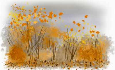
Vampiric bloodsuckers are somehow considered cool and sexy and are all over the place these days, especially around Halloween. But what is the REAL bloodsucker that is all over the place these days? It's our friend the Bedbug, who is infesting human space in renewed hordes, leaving unsexy, painful, itchy bites all over its victims. Imagine those hot vampire bites as ugly raised red marks itching like hell. No trick or treat for these little monsters! Happy scary day and don't let the bedbugs bite ya!

"Bedbugula" is Photosuck, 7" x 10", a wasted hour or so on October 31, 2010.

Saturday, October 30, 2010

Natick Architecture


Natick, Massachusetts was mostly built in the late 19th and early 20th century. The buildings of Main Street date from the 1880s to the turn of the century. The building where my mother's art studio is, was a dance hall in the previous century as well as an office building later on. It's still a dance hall, not for adult pleasures but for little girls who take dance classes there. It doesn't have an elevator. To get to the upper floor you have to march up about 20 steep steps made out of hard granite. It would be prohibitively expensive to install an elevator, and you cannot do too many changes to the building because it was declared a "historic" edifice.

Once you get to the top of the steps and into the studio, you see other ornate 19th century buildings across the street through the tall studio windows. One of the buildings was built by the Freemasons and an upper room is still used for ceremonies. This is a drawing of some of the ornaments on this block. They don't build'em like they used to. Pitt pen on sketchbook page, about 5" x 4".

I returned home after a hellish 2-day journey on roads plagued by deterioration, traffic, and construction. The visit home was very difficult. The best part was wine tasting with my mother. There were many other parts which are not the subject of this By-product. But I am home now and must immediately return to my projects, such as making enough art to show and sell at Darkovercon (coming up for the 33rd time next month) and learning to digitally draw and paint beautiful girls.

Friday, October 29, 2010

The parents' door


I didn't post yesterday due to circumstances I won't go into, here. But I am now in New Jersey on my way back to the DC area from Massachusetts, and there's hotel internet, and my little laptop can process stuff in Photoshop, so here's a post. This is a drawing of the front door to my parents' house, looking out from the den. The glass-fronted cabinet to the right is filled with cups and glasses. In the foreground you can see part of a couch, with a round cushion on it and a gift bag (containing some of my mother's birthday presents). The scrollwork on the glass door frame is old rusty aluminum but is original to the house from the mid 50s when it was built. Outside the door you can see wind chimes hanging from the eaves and a hanging planter. Our family belongs to a very recognizable American subculture of artsy Northeastern intellectuals, if you know this type you immediately will know what I am talking about. If I were an interior designer I would love to restore this house to a fresh re-envisioning of "Mid-Century Modern" but that is not going to happen. This visit has been very difficult for me.

Drawing is Pitt drawing pen on sketchbook paper, about 7" x 7". Photographed with my digital camera and then cleaned up in Photoshop from shadows and distortion. No scanner necessary! Some greyscale tone added, also in Photoshop.

Wednesday, October 27, 2010

New England, as advertised


Yes, it's a photograph. I don't see how making a painting of this would add anything to my appreciation of the sight. These trees are on the street where my parents live, where I grew up. The house down the street there is not the parental home. Nature turns up the saturation and goes over the top here, at this time of year. I spent today looking at the brilliant colors as well as socializing with the family. I am on my best behavior.

Photo taken with a Canon S90 "point and shoot."

Tuesday, October 26, 2010

Calendar Scenes of Fall


Photoshop has a number of artist-friendly options for making "realistic" trees and leaves. The "Scatter" and "Shape Dynamics" brush modifiers create pixel scattering which looks like leaves. The "Brush Creation" option allows you to make a "digital rubber stamp" in exactly the leaf shape you want, and then the aforementioned options will scatter your leafy image wherever you want to place it. I traced real leaves picked from the big pile beneath my parents' maple tree. As for color, Photoshop has the "Color Dynamics" option which makes your brush appear to shift colors while you are applying your virtual paint. All this is a fair imitation of the traditional painter's use of mushy brush ends dipped in a dry mix of paint and then dabbed onto the surface. In this way, nice seasonal images can be made that look like a calendar scene for October or November.

Here is what a real scene of calendaric Fall looks like. I took this at the Nashoba Valley Winery where I gave my mother a wine tasting for her 89th birthday. "Real," of course, must be qualified in photography. The colors of this photo have been Photoshop enhanced so that they look the way fall leaves really look to our imagination.


Monday, October 25, 2010

New England Colors, Cloudy Evening


The fall colors are quieter under cloudy skies, especially in the evening when a bit of mist and rain is in the air. I saw this fleeting sight out my car window as I toiled through the highways up to Massachusetts. The roads are under construction in many places and backups hinder journeys every day. But here I am in my original home state, with orange leaves everywhere. I hope to continue making sketches when I can. This is Photoshop with Wacom Bamboo tablet, from memory, about 7 inches square.

Sunday, October 24, 2010

Bagels and Autumn Lunch


As promised I'm posting from my hotel room at my stop-off place in New Jersey. Before I left Falls Church I stopped by Mena's sandwich and donut shop for a send-off bagel. Thus I was able to take this picture of my newly re-decorated sign. Through the marvels of modern technology I processed the picture and am posting it right here from my laptop through wi fi. I don't take this for granted. But other people are already posting from their thought-directed, inner/holographic visualization headsets while they are on the supersonic jet flight to Tokyo to dance with genius-intelligent, empathic robot babes. You won't get those in New Jersey for a long time to come.

Tomorrow I head for New England which is full of colorful leaves. What would Norman Rockwell do if he had to use Photoshop for his illustrations? Maybe I'll find out.

Saturday, October 23, 2010

Auroras of Autumn


I haven't seen an aurora in a long time, but they sure are lovely. And it's a way to use a color which almost never occurs in nature, namely that pale green I like to call "Aurora Green." Some minerals are that color, and Luna moths, and probably many sea creatures, but the Aurora makes it luminous. I borrow the title from a long set of poems by my favorite American poet, Wallace Stevens. This one was painted with airbrush and is another attempt at portraying auroras if they were in space, not in an atmosphere. I think with the right conditions it could happen. Besides, "Cosmic Aurora" sounds nice as a title. Painting is acrylic on illustration board, the usual.

If you zoom in on this little painting, you can excerpt out places which are just color fades and sprinkled bright spots. It's grainy, but that's part of the texture. It looks like, uh, "real" modern art such as that of Jules Olitski (link is old, and the artist has gone on to the abstract Beyond, but it's the best I could find).

But it isn't "real modern art," 'cause it doesn't have that social message and rough ugliness that current art needs to have to be considered art. They criticized Olitski for painting too pretty, too.


Meanwhile, I will be going on another of my trips to New England for parent care and relative visits. Rather than interrupt the By-Product altogether, I will try to keep posting, with images I can make when I have the time. Wish me luck.

Friday, October 22, 2010

More Fashion Faces


I'm continuing with practice in pretty girl faces with Chris Hart's book "Figure It Out." These are commercial art and fashion faces, not the gloomy portraits of fine art. My friends gave me a book packed with pin-ups, my current art fascination. I found a lot of artists I had never heard of before, such as Fritz Willis, whose sophisticated fashion-oriented pin-up girls were part of that mid-century look (there I am again in Mid-Century Modern territory). No matter whether it is politically or feministically incorrect, I think pin-up girl art is fun. I copied some faces from Fritz Willis paintings.

Working with commercial art models rather than fine art models (I am using "model" here not as the posing art model but as a mode of working and a style of image) is a new approach for me. Whatever training I have has been in the rigorous and ultraserious world of fine art. Building from cartoon sketches rather than anatomically and perspectively correct life studies is new to me. I'll see (and you will too, I hope) how this will work out.

Here is a selection of fashion faces from my work with the Hart book and from the pin-up collection. Plain old pencil on sketchbook paper.

Thursday, October 21, 2010

Red Star In Space


I had to Photoshop the heck out of this picture just to get it as clear as it is now. This was taken back in the days of film cameras with adjustable exposures and I was, to put it bluntly, a crappy photographer. But in a way the grainy, washed out colors are reminiscent of the poorly printed reproductions of cover art in old science fiction pulp magazines.

This picture is called "Red Star in Space" and it is meant to recall not only pulp illustration but the Soviet Russian era of space exploration in which ungainly spacecraft were launched on perilous missions for the Motherland. That same Soviet space program was glorified by fantastic Russian artists who are unknown in the West. Note the red star illuminating the planet. The Russian artists would add a fantasy design element to a spacecraft which doesn't need streamlining at all in the vacuum of space. A spaceship could look like a tank and still do all the things it needed to do. But this is the Future, and things are streamlined in the Future.

"Red Star in Space" is acrylic on illustration board, 9" x 11", February 1995.

Wednesday, October 20, 2010

Making the Girls Smile


I reached the page which shows me how to make a smiling face. Again, this is something that I have never done well. These are some of my attempts. First I draw the girl without the smile, looking rather glum. Then I draw her again, smiling. I hope there is some consistency in the face so you can tell it's the same girl. The top two are repeated below them, but the bottom one goes from left to right. Interestingly, I think they look sexier when they are not smiling. I will have to keep drawing these. If she doesn't smile, I will have to tell her funnier jokes.

Pencil on sketchbook page, 7" x 12".

Tuesday, October 19, 2010

Cosmic Jet


Black holes are by now familiar objects, astonishing as they are. But some scientists speculate that a black hole is a passageway to another universe or another part of this universe. At the other end of the tunnel, material sucked in by the black hole spews out into space as a "white hole," or a cosmic jet of high-energy plasma and excited particles. This astronomical fantasy depicts what a "white hole" might look like. No one has yet detected something which could be identified as a white hole. At least, no one on this planet has detected it.

"White Hole" is acrylic on illustration board, 10" x 7", January 1998.

Monday, October 18, 2010

Birds of Moldworld


It's a sunny day on Moldworld. In this world, birds have fur. The thick atmosphere allows them to fly with their furry wings. These furbirds are about four feet tall.

Photoshop, 10" x 7", about 1 and a half hours' work, October 18, 2010.

Sunday, October 17, 2010

Traffic over Rustworld


Here's some "classic"-style science fiction illustration from the era of BABYLON 5. I'm also influenced by the work of Vincent diFate, who just keeps putting out great illustrations decade after decade. This uses airbrush for the background and hand painting for the foreground. These spaceships cluster around a planet composed mainly of iron oxide, hence "Rustworld." Like our Mars, this planet probably had an atmosphere and water at some point, but is now dry with a minimal atmosphere.

"Traffic Over Rustworld" is acrylic on illustration board, 8 1/2" x 11", February 1995.

Winery portrait update: I delivered the painting to the winery on Saturday. The winery folk were thrilled and they gave me a case of selected wines as payment. The painting will go on their wall and will also be used in prints and greeting cards.

Saturday, October 16, 2010

Naked Mountain Wine House Color


Here is the colorized version of the black and white drawing I showed in the previous posting. This building is the tasting room and event hosting area at Naked Mountain Winery. You can see a part of the vineyard with its rows of vines to the left. I have made this picture as idealized as I can, though it is quite close to the reference photograph I took. The golden light and autumn leaves are always winners in food and wine advertising. I think the winery owners will like this.

"Naked Mountain Wine House" is ink and watercolor on Fabriano board, 14" x 11".

Friday, October 15, 2010

Wine house Drawing


This is the only thing I am really good at drawing. If it's a building, I can depict it in loving detail. This is a real building, the tasting shed and party area at "Naked Mountain" vineyard and winery. The owners requested that I do a portrait of their building, since it is about to be remodeled. What you see here is a black and white drawing (actually, there are little bits of color as indications) which will be colored in with watercolor. When it's done I will frame it and present it to the vineyard owners. They are paying me in wine, and a bit of publicity since this will be placed on the wall for the wine-sippers to see.

Base sketch for Naked Mountain Wine House, ink on Fabriano illlustration board, 14" x 11".

Thursday, October 14, 2010

PInk Gas


I'm running out of these space pictures, I only have a few more to digitize. Then I will thankfully move on to digitizing other vintage art pieces of mine. At the moment I feel not able to do any art especially art involving images of people. Some artists who specialize in environments or architecture get away with simply not working with human images but I would regard that as a cop-out for me.

I am facing a problem that plagues me in other learning situations. I will try to define it here. If I am learning something, do I have to start from the absolute beginning each time I try to learn it again? As some longtime readers of this blog (two of you, hi there) know, in 2008 I did yet another attempt to learn to draw human figures. I may have produced a few half-decent drawings though none of them were from life, only photographs. Now I'm trying again to learn to draw human faces and figures, as if I had never drawn them before. Does that mean I have to avoid drawing them until I am up to speed with the new method?

I know this probably sounds absurd to you. But learning for me is a Sisyphean task of trying to keep learning while I forget an increasing amount of stuff I need to know. And a book I've recently read, "Bounce" by Matthew Syed, states that in order to truly get good at something, you need to have put in 10,000 hours of challenging, learning practice. I worked that out on my calculator. If I spend 2 hours a day practicing drawing human figures, and I don't drop it too many days, it will take me about 13 years to put in my 10,000 hours. So I'll see you with some really nice, beautifully rendered digital pin-up girls...in 2023.

Wednesday, October 13, 2010

Golden Feast


I have been knocking out these idealized food scenarios for Trader Joe's departments, one after another. You saw Meats, Cheese, and Cornucopia of Produce. Here's "Golden Feast," celebrating pre-made meals, dips, and deli items. It looks a little "middle eastern restaurant" but there is plenty of hummus there. The flowers are depicted as they are in a Trader Joe's bouquet called "Fired Up for Fall." The TJ flower bouquets have these poetic, evocative names that conjure up a whole mood, like "Wildly Flowered" (which had wildflowers in it) or "Deep Blue Sea" which featured blue and white flowers and is no longer available. It's kind of like the poetic names given to shades of paint by the paint company's marketers. Not just "Harvest Gold," but "Sunset Pink" and "Velvet Curtain Red." This is advertising, the real fantasy art. Some copy will be placed on a transparency over the empty area of yellow to the right.

Meanwhile I struggle to scratch out "pretty girl" faces in my notebooks. I won't be satisfied until I can draw perfectly proportioned pretty faces, without erasing more than I draw. It's interesting how I can find these features in a select few of the females I look at day by day at work. Most females over 30 don't fit the ideal proportions. But that isn't what people want to see in art. As an illustrator, the last thing I want to do is draw an ugly or plain character - unless that's what the art director wants.

"Golden Feast" is acrylic markers and spray paint on Masonite, 4 feet by 2 feet, October 12, 2010.

Tuesday, October 12, 2010

More Girl Faces


My latest art quest may look stupid to you, but it's important to me. I feel I need to re-learn to draw faces, heads, and figures. None of the figures or faces I have ever done look right to me and so I am trying again to draw them using instruction books for beginners. The girls you see are done according to the proportions set out by my instruction book. The reason they all look rather prim and expressionless is because I don't know how to do facial expressions yet, the book will show me later on. And if they all look alike, it's because I'm working to a formula. I added a bit of character in the upper row, especially the face in the upper right which is modeled on a Hollywood diva actress from the 1930s.

Right now I don't feel confident doing any art, other than the commercial and architectural stuff I always do. But I am still determined to be an illustrator again. I will eventually have to work these figures and faces into highly realistic digital paintings and that is another major learning project. In the next couple of sessions I might learn to make the girls smile.

Monday, October 11, 2010

The Glory of Cheese


In the ideal, flowery world of Trader Joe's autumn displays, the abundance is never-ending and it doesn't make you gain weight. Here is a display of a variety of cheeses, along with fruit and wine, ready for your feast. (The crackers are in the back where you can't see them.) The table is set outside with the Blue Ridge in the background and two bottles of Virginia's best wine (which TJ's does not sell). The dark area in the upper right corner is unpainted and will be rounded off in the final version. All is bathed in a dreamy, golden evening light, when the haze settles over the hills and the stink bugs swarm.
Wait, don't mention the stink bug swarm.

"The Glory of Cheese" is acrylic on Masonite board, 4 feet by 2 feet, October 2010.

Sunday, October 10, 2010

Naked Mountain Winery

"Wine Saturday" brought me this weekend to "Naked Mountain" Vineyard and Winery in Markham, Virginia, near Front Royal. Like most of the wineries I've visited, this vineyard was set in a beautiful environment with mountain vistas and wooded hills. I tasted their selection and found the reds to be especially good. I have tasted Virginia wines for twenty years and in earlier days the Virginia red wines were dreadful. But now places like "Naked Mountain" are doing well with them. I didn't see anyone naked on the mountain, though people were certainly having a good time.

I did this sketch in markers, rather than colored pencils, just to see how well I could render a landscape in marker. I was somewhat in a hurry, so it isn't as precise as I would like. The view goes out to the blue hills, while the vines are in the middle ground supported by pickets. Autumn gold has arrived in the Virginia hills.

Vineyard view, markers on sketchbook paper, about 7" x 7".

Saturday, October 9, 2010

Exoplanet Beausoleil


Imagine an exoplanet, an Earth-like planet, which instead of orbiting a modest little star like ours, orbits a great blue star shrouded in a maze of nebulosity. The zone of habitability about such a star, where temperatures could sustain life, would be far away, so far that the planet would take centuries to make a single orbit. The radiation levels would be quite high, too, but there are living things that can stand such levels. The world would be very different in any case. "Beausoleil" means "Beautiful Sun" and describes what the inhabitants of this world would see: a star with a heavenly aura around it, the atmosphere flickering with auroras every night.

"Beausoleil" is acrylic on illustration board, 7" x 10", July 1992.

Friday, October 8, 2010

World of Fair Oaks Mall


I took an adventure trip to the world of Fair Oaks Mall in Fairfax, Virginia on Thursday. This forbidding, futuristic environment houses 189 stores full of goods that I would not buy, and one, Sears, where I did buy. As I sipped coffee from the mall Starbucks,, which may also qualify as a store at which I bought, I drew pictures of the interior from my secure vantage point. Note the shapely naked leg of a middle-aged male native, in the foreground.


The ceiling of the mall is broken up into an irregular jumble of hard angles, flat planes, and skylights, some lit by artificial light and some by sky or sun. It's kind of like Escher on cocaine. The mall opened in 1980, and it is brutalist architecture of the 1980s assigned to a consumeristic, commercial space. These bizarre, ominous coffers, painted white, are designed so that the viewer hardly knows which is vertical and which is horizontal. It was quite a challenge to draw. You would think that these flat, complexly angled spaces would absorb sound and make the mall quieter, but in fact they reflect sound all over the place and this is one of the noisiest malls I've ever visited.


And there in the atrium is the Elevator of Doom, oscillating ponderously between the dim netherworld and the searing heights. Made of industrial steel with lights and rivets, looking vaguely like Darth Vader's mask done in polished metal and plate glass, this conveyance gives the mall-goers a panoramic view of the fountain, the hallways, and the retail prospects at every angle.

Pitt drawing pen on sketchbook pages, October 7, 2010.

Thursday, October 7, 2010

Star of Serenity


I was all ready to post this red/blue astronomical fantasy when my Internet connection again went down. Cox Communications gave me a brand new modem so this was not supposed to happen. It just proves that something, somewhere, is full of crap. But enough invective. Here's another nebula picture, similar to others I have done. A fresh new star illuminates the gas around it, while other sections of the nebula glow in hydrogen-alpha red. This painting is slightly bigger than the usual ones, so that when reduced in size the details and texture are smoother.

"Star of Serenity" is acrylic on illustration board, 11" x 14", July 1992.

Wednesday, October 6, 2010

Cornucopia


The bounty of Autumn comes to Trader Joe's, pouring out of a traditional cornucopia which I painted on Tuesday. The background depicts the Blue Ridge mountains in early fall, with red and gold touches. The vegetables and fruits in the cornucopia basket are right there beneath where the sign will be put up. The "vignette" on the corners will disappear when the board's corners will be cut in a curved shape. A message will be added to the sign, written on a transparent overlay. This sign will be up all the way through Thanksgiving, when it will be replaced with "holiday" themed displays. The manager who ordered this sign hopes that it will be kept as part of the store's display resources, to be re-used next year at this time.

The style is somewhat "folk-arty," since I didn't have the time to produce a truly realistic still life painting. I wanted to make sure that I depicted as many produce items as possible, including mushrooms, tomatoes, peppers, apples, a butternut squash, and a honeydew melon.

The Cornucopia sign is acrylic brush work and acrylic markers on Masonite. 4 feet by 2 feet, October 5, 2010.

Tuesday, October 5, 2010

Girly Doodle Faces


So here I am, copying girl faces from my instruction book with just a pencil on sketch pad paper. When I was just a young thing in middle school, I used to see other girls doodling these "pretty girl" fashion faces or profiles on their notebooks or wherever else they would draw when they were bored. The style is distinctly a late-60s or '70s look of the American ideal: round white face, pert upturned nose, big wide eyes with lots of makeup, and a puffy hairdo. Meanwhile I was drawing Roman and Greek warriors with bronze crested helmets. Or superheroes.

I have returned to the level of a bored schoolgirl as I learn to draw these conventional girl faces. What is interesting to me is how exacting the depiction of "prettiness" is. One tiny disproportion, one wrong angle, and she is no longer pretty, she is stupid or even evil-looking. Or ugly. It just takes one little pencil stroke to change her character.

I need to draw hundreds of these, and fix the perfect proportions of prettiness in my mind. Here below are two I did in Photoshop with my Wacom tablet. I'd like to draw them both in traditional pencil and paper, and on the digital tablet.


Monday, October 4, 2010

Superfilaments


Here's another one of my classic blue-and-red nebula pictures. This one depicts filaments of glowing gas, backed by another section of the nebula emitting hydrogen alpha red light. The title of the picture is "Superstrings," but to be scientifically proper that is a wrong title because the "strings" proposed by string theory would be invisible to anyone living on our scale of reality. Therefore a more accurate title is "Superfilaments," though there is nothing "super" about them. It's just gas.

"Superstrings" is acrylic on illustration board, 10" x 7", July 1992.

Sunday, October 3, 2010

Winery Outbuildings and Vines


Today's Saturday Vineyard Visit brought me to the Gray Ghost Vineyards and Winery, in Amissville, Virginia. The winery is named for a famous Confederate guerrilla fighter, John Singleton Mosby, known as the "Gray Ghost" for his stealth and daring operations behind enemy lines. Gray Ghost is located in the heart of the territory where Mosby lived and fought. It's a small winery compared to some of the others I've visited, but the quality of its wines is excellent. They produce fine reds, such as a Merlot and a dry rose'. But this is not a wine blog, but an art blog, so I present a sketch done in about 15 minutes of some outbuildings on the Gray Ghost site as well as some of their vines, supported by slanted posts.

Pitt fine point pen on sketchbook page.

Saturday, October 2, 2010

Girls, Girls, Girls


I'm working on a new learning project. I am finally going to learn how to draw pretty girls. All my previous attempts at drawing a pretty girl have failed. There are many reasons for this and one of them is that I was trying to draw faces realistically. What I really want to do is create fantasy women characters and many of these go by cartooning and drawing formulas. I am working with a book I just got, called "Figure It Out: The Beginner's Guide to Drawing People" by Chris Hart. This takes a cartoony approach rather than a "serious" realistic way, and works without a model, since he knows that most aspiring artists don't have easy access to live models.

He starts with faces. He demonstrates how faces are structured by using basic shapes. He gives you examples to copy, and shows how they fit together. I have been filling pages with pretty girl heads. These are some of the better ones. They all look kind of alike, they all may be the same girl, but that's because they're done from a formula. Later on Hart will teach me how to put expression and individuality into the faces. The book covers how to draw the whole body, and includes how to draw males too. One thing I've noticed is that the prettier a girl is, the less individual she looks. My favorite in this set is top row, second from left.

Faces were drawn in pencil, and excerpted from scanned drawings. October 1, 2010.

Friday, October 1, 2010

Tasty Treasures New Items


I have been doing a lot of art for Trader Joe's lately. After the "Butcher Shop of Light" I proceeded to the "New Items" sign, featuring a clipper ship loaded with tasty treasures. This is the third time in my tenure at TJ's that I have done the "New Items" sign. The yellow sign at the top which says "New Items" reminded many of my co-workers of a shark's fin but it is really a triangular sail. I like that shape, the triangle with bent sides. The New Items sign is now in place but the lower part of the sign, with the blue waves, is currently blocked from view by many boxes of TJ's very popular Pumpkin Bread and Muffin Mix.

Acrylic on masonite with painted foamboard application, about 40" x 30". September 29, 2010.