Wednesday, March 31, 2010

Physalia-Ships


The Physalia is a form of sea life which drifts through tropical waters. It has a sail-like bulb at the top and a tangle of extendable tentacles underneath. It is poisonous and will give painful stings to any human who touches it. I envisioned spaceships built like Physalia, with a hard central shell and long streamers reaching outward from it. Perhaps the streamers are a form of biomorphic space drive, as there doesn't seem to be any conventional form of propulsion. Probably the aliens who travel in these ships resemble Physalias, and are used to either aquatic or zero-G life. The stings would be bursts of radiation which would burn anything that came into contact with the streamers.

"Physalia-ships" is acrylic on illustration board, 10" x 7", September 1990.

Tuesday, March 30, 2010

War Bikini


Here's my next attempt at doing another scantily clad battle Amazon. This doesn't suck as much as my first warrior woman, but it isn't up to "World of Warcraft" standards yet. Here's what I'm aiming for with these. I view all figure drawing, and all "realistic" digital painting, as a challenge to me, whereas drawing buildings or other stuff I'm actually good at, is not much of a challenge. I need a challenge - or a commission - to do good art. Oddly enough, I am not much of an artistic self-motivator except in certain special areas, like my Noantri world, which no one, except a couple of my friends, is interested in. I really like working to order. I don't like to just do stuff for myself, that no one else sees or appreciates. I'd rather publish mediocre art than hide excellent art.

I guess I'm an egotist. I want an audience and fans and recognition. That's one reason I'm trying to do "conventional" fantasy subjects like warrior women. These stock figures (or gaming characters) are also a way for me to learn how to handle the digital painting medium so I can get "realistic" renderings out of it. This piece didn't take me as long as the previous one I published here. I still have problems with the proportions on the figure, in that they have to be exaggerated: longer limbs, rounder bazooms, flexible back, smaller head. And also, to design true fantasy female warrior costumes, I must abandon all sense of utility and just go for the "showgirl" aspect of it. I mean, it's got to be realistically rendered, but in "reality," totally absurd. There really were women warriors in ancient times, but they wore armor or some body-covering protective garments. They did not, alas, go to war wearing bikinis.

"War Bikini" is Photoshop, 7" x 10", March 2010.

Monday, March 29, 2010

Round Spacecraft


Here's another in my later 1990 series of space miniatures. This was called "Round Probe" though it might be an escape pod or some sort of shuttlecraft, as it has a large engine to propel it. I like to look at pictures of old hardware from industrial or military or civil engineering and then re-create it as space architecture and hardware. I was once again trying for that high-contrast Vincent diFate look here. If this is an escape pod, there's a lot of space for the rescuers to cover; I hope that the passengers are saved.

"Round Probe" is acrylic on illustration board, 10" x 7", September 1990.

Sunday, March 28, 2010

Iconic Mid-Century Modern Car Shop


It's my first outdoor drawing of the year! Here is a specimen of mid-century modern vernacular auto architecture in Fairfax, VA. I did it while sitting on a rickety splintery wood pallet at an outdoor flower shop in the parking lot. Note the classic office area with the big windows. There were also cheerful if faded accents of blue and red. The same kind of layout is still used in fancy modern houses. No architect can resist the enormous floor-to-ceiling windows. I like the buildings in my neighborhoods, usually small business buildings, that no one notices. They are often hidden architectural gems. I hope to bring you more of them when the weather gets warmer.

Small sketchbook drawing, about 5" x 3".

Saturday, March 27, 2010

Lebbeus Tower


I have been a fan of architect and artist Lebbeus Woods for many years. His fantastic drawings occupy a space which is both science fiction and Serious Art, a place I devoutly wish to occupy, (while doing gross, vulgar fantasy art for fun). You can't build these things, unless you are building a model or a stage set, but they are memorable and influential on many other architects. Woods himself is a wild eccentric with a perverse imagination, who has traveled the world getting and giving dark inspiration. This is one person I would really like to meet, but he would despise me as a trivial suck-up.

Inspired by Lebbeus Woods' designs, I created this image of a tower on the Moon, in the harsh light of airless space. It could be an exploration rocket which has been turned into an inhabited colony, or it could be a weapons station for lunar warfare. Tracks from lunar rovers have pressed a road into the dusty surface, where the occupants come and go.

"Lebbeus Tower" is acrylic on illustration board, 7" x 10", September 1990.

Friday, March 26, 2010

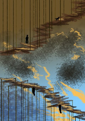
Escher Orientale


Here's a little speedpaint I did tonight in Photoshop. I guess the gravity gets a little odd in Cathay, after all it's on the other side of the world from me so things must be upside down! And so if you walk up the suspension bridge, you will get to the center where all things face each other, like the petals of a golden flower.

Thursday, March 25, 2010

Two Dimensional Space Warp


In late 1990 I was feeling avant-garde. I had an avant-garde moment where I painted a whole series of unusual stuff over the usual airbrush nebula and star backgrounds. This was one of them. I chose shapes made out of curves, mostly triangular shapes, and painted them on top of a standard space "blank" which I made in batches. I had no intent of telling a story or making the shapes mean anything, it was just one of those abstract things. In order to get it into a science fiction convention art show (Philcon 1990), I had to make up a title that would fit, so I called this "Two-Dimensional Space Warp."

Nowadays I could toss this off in Photoshop and Adobe Illustrator in an hour or two. I am not selling anything these days, so if I must make art I might as well do it in pixels which take up no space whatsoever in my cluttered studio. But Balticon is coming up so I may have to actually paint some of these in real paint so that someone might buy it.

I'm not feeling very good about my art these days. I'm faced with the choice of making formulaic space abstractions, soporific country scenes, or kitschy fantasy art. I have limited time to make art so I have to be careful about my choices 'cause I don't want to waste time on something. So I waste time looking at other people's fabulous digital extravaganzas on DeviantART instead.

"Two-Dimensional Space Warp" is acrylic on illustration board, 10" x 7", September 1990.

Wednesday, March 24, 2010

Future-Historical Fantasy


We think of science fiction as (usually) depicting the future, but what if it was really the past? Imagine a civilization far past its prime, or just recovered from a dreadful crash that forced them to start all over again, but they still retained their memories and history and images of their past. Their technology was forgotten or destroyed, but they could still see what it had been like. Spaceships like this would be the "future past," and if the civilization was lucky enough to avoid another debacle, might be the future future as well.

When I painted this picture in 1990, I thought it was a failure. I took a chance on the unusual angle of the spaceship, even though in space, there is no "up," "down," or "slanted." Nevertheless art viewers want their spaceships to be as perpendicular as cars or buildings, or at least appear to be moving to justify any unusual angle. I was also trying desperately to reproduce the ultraslick, "brushed-aluminum" techno-sheen of the Art Center College of Design look. That look hasn't changed in the 20 years since I did this piece, except it's all done digitally now, and I still aspire to it.

I look at a lot of other people's art, both fantasy, science fiction, and architecture. The almighty Web brings me loads of art, new stuff every day. I feel less and less competent when I look at the good stuff. I don't feel more competent when I look at the scribblings of amateurs. That's not who I compare my work to. Even if I don't sell a single picture, I still want to do that professional-style fantasy and science fiction art. But gosh, haven't I grown out of it by now? I feel embarrassed that in my middle age I still want to do fantasy and s.f. subjects, rather than the dignified mathematical abstractions of my "high art" line or my cozy Virginia landscapes, suitable for a mature person.

"Future-Historical Fantasy" is acrylic on illustration board, 10" x 14", August 1990.

Tuesday, March 23, 2010

Jungle Joe


Back to commercial reality. This is the "indicator" for this month's Trader Joe's "Flyer," the booklet that advertises goodies. Copies of this design are placed wherever there are flyer-featured products. The theme and explorer character were dictated to me by the manager, and I did the realization, complete with the standard pulp-magazine "adventure" graphics. Jungle Joe's expression is a bit googly-eyed, but perhaps you'd have that expression too if an ocelot was looking over your shoulder.

Flyer Design is 8" x 4", ink on paper, colored in Photoshop, March 2010.

Monday, March 22, 2010

Persian Angel of Humanity


The last of my Seven Persian Immortals is "Spenta Mainyu." The word "Spenta," I"ve already tried to explain, but "Mainyu" is equally multi-meaning. It is an ancient Indo-European word which contains the root of our English words like "mind," "mental," or even "manic," but doesn't quite mean "mind." It's most often translated as "spirit," but not necessarily as a "disembodied entity." Some Christian-influenced scholars translate "Spenta Mainyu" as "Holy Creative Spirit."

This seventh Immortal is neither male nor female. Its guardianship is humanity, and it/he/she stands for people. I have given it the color purple, neither red nor blue, androgynous. Spenta Mainyu is wearing the ceremonial robes and cap of a Zoroastrian priest, and holds a bundle of sacred twigs in its right hand. (Remember the Iranian priests holding evergreen branches at rituals.) In its left hand is a cup of holy water, also used in rituals. Behind Mainyu's head are the wings of the Persian imperial "Faravahar," the winged disc that was used as the King of Kings' insignia and is now used as the symbol of the Zoroastrian religion. The down-facing purple wings are from a Persian carving of an angelic royal personage. In front of Mainyu is an urn bearing a dish with the Sacred Fire of the Zoroastrian religion burning on it.

With this last Immortal I welcome the New Year and the springtime. The ancient and still-living faith of Persia is always an inspiration for me and I will probably return to Zoroastrianism and its mythology for artistic inspiration in the future. NoRuz Pirouz, as they say...."NoRuz is victorious!"

"Spenta Mainyu" is acrylic on illustration board, 8" x 14", July 2000.

Sunday, March 21, 2010

Persian Angel of the Earth


The words "Spenta Armaiti" are hard to translate. "Spenta" is often translated as "Holy," but there is also an element of "creativity" and "growth" in it. "Armaiti" is also many-valued and is sometimes thought of as "Piety" or "Reverence" but it is more often translated as "Tranquility." The allegorical figure in the Immortals is Spenta Armaiti, Holy Tranquility. I have portrayed her as an elder woman, the third of the three ages of woman, and she is attired as a Persian Queen with a crenellated crown. Her guardianship is the Earth and the land, so her body is made up of earth textures and colors, with the sacred mountain of Iran, Mount Damovand, in the distance.

In the background are two crenellations from the royal center at Persepolis, which symbolize mountains. In back of the Immortal's cloak, in a circle, are textures from Earth as seen from space. The colors are all in the dark blue or indigo range, which I assigned to Armaiti in the Immortal spectrum.

The typeface, by the way, which is on all of these Immortal portraits, is one that I made up especially for this series. I call it "Cuneiform." It is inspired by early twentieth-century fonts used in Art Nouveau or Art Deco graphics.

"Spenta Armaiti" is acrylic on illustration board, 8" x 14", February 2000.

Saturday, March 20, 2010

Persian Angel of Wholeness and Water


Ameretat is almost always mentioned with her "sister" Immortal, "Haurvatat." Haurvatat means "Wholeness" or "Integrity" in ancient Persian, and she has guardianship over Water. Zoroastrian practice is very concerned with maintaining purity and cleanliness in the natural and domestic world. They don't want to pollute water, earth, air, or fire. In some ways the ancient Zoroastrians were the world's first ecologists.

I used light blue and silver to depict the Waters symbolized by Haurvatat. Her dress is taken from a Sassanian Persian carving design. The motif of her urn pouring cloud water into earth water is borrowed from a small painting by Edward Burne-Jones called "The Earth Mother." Her crown is decorated with stylized fountains. Haurvatat is portrayed as older and more full-figured than her younger sister; she is the "Mother" of the three ages of woman.

Today is NoRuz, the Persian New Year. All over the world, wherever there are Persians or people of Persian heritage, they will celebrate this holiday of the spring equinox and the world's renewal.

"Haurvatat" is acrylic on illustration board, 8" x 14", January 1999.

Friday, March 19, 2010

Persian Angel of Immortality


"Ameretat" means "immortality" in ancient Persian. The Immortal of Immortality is the first of the three female allegorical figures in the seven Amesha Spentas. I depict her as a young woman, the "Maiden" of the Three Ages of Woman.

Ameretat's guardianship is the creation of Plants, which are essential to our lives. Plants are kind of immortal, perishing in the individual but lasting forever from seed to growth to seed. Naturally, her color is Green. All the plants in this picture are copied from ancient Persian and Assyrian carvings. The evergreen tree to the bottom left in the painting represents the "Zoroastrian Sarv," a sacred cypress tree in Iran that is said to be over 4,000 years old. In Iranian Zoroastrian rituals to this day, priests hold branches of evergreen as they pray.

I did this picture after a visit to Florida. I was fascinated by the vegetation there, so different from what I was used to. Both the Middle East and Florida are home to palm trees. I tried to capture the feeling of Florida in the background of the Green Immortal.

"Ameretat" is acrylic on illustration board, 8" x 14", February 1998.

An extra note: Many thanks to Tristan Alexander for his faithful visits and comments on this blog. I have no idea who else is looking, but it's nice to know there's at least one. Also, this is the second anniversary of the beginning of this blog. "Art By-Products" is now two years old.

Thursday, March 18, 2010

Persian Angel of Power


"Khshathra Vairya" means "Chosen Dominion," or "Chosen Power," in ancient Persian. The name of this Immortal refers to Zarathushtra's concept of moral power and the right use of power, especially in political matters. In his founding text, the Gathas, Zarathushtra introduces the still-revolutionary concept of right use of power and morally good rulership. In his day, as in ours, political and religious leadership was in the hands of unscrupulous and corrupt people. He created an ideal that matched goodness with political power, something which was almost unthinkable more than 3000 years ago and is still very rare now.

This figure of Khshathra also represents the sector of Creation of metals and the sky. Metals are a constant motif in the history of power, whether they be precious like gold or silver, or useful like copper, bronze, and iron. Metal makes weapons, transportation, and defense, as well as currency, thus it is essential to maintaining any political or social power. Thus I show a broadsword as well as a silver ring which symbolizes dominion in Persian art.

I used gold and silver and bronze as the colors for my portrayal of Khshathra. I also made his image as an elder King, the third age of manhood in my set of six allegorical characters. His royal costume and crown is taken from depictions of Persian rulers from the Sassanian era (225-650 A.D.).

"Khshathra Vairya" is acrylic on illustration board, 8" x 14", October 1997.

Wednesday, March 17, 2010

Persian Angel of Good Thought


The second of my Zoroastrian Angels is "Vohu Manah." This means "Good Thought" or "Good Mind" in Avestan, the liturgical language of ancient Persia. This figure has many meanings. It is a male character, but rather impersonal in the Zoroastrian religious world. One meaning of "Good Thought" is "Compassion," for all the living things of the world and the Earth itself. Another meaning is rationality, reason, and avoidance of evil, the moral virtues of this Immortal being.

I made Vohu Manah a mature male in his prime, rather than the youthful image of Asha Vahishta (see yesterday's post). I've pictured each Immortal except one, as one of the three ages of man or woman.

Vohu Manah is the guardian of Animals, and I've portrayed him with a dog. Dogs are sacred in the Zoroastrian religion, and in the scriptures they are treated with almost as much reverence as human beings.

In the Vohu Manah portrait I used motifs from the carved capitals of the columns at Persepolis. Animal forms were everywhere in ancient Persian art, such as the bulls' heads and forelimbs on the column capitals. The four symbolic animals of the Christian Evangelists, that is Matthew's man, Mark's Lion, John's Eagle, and Luke's ox, have their origins in these much earlier sacred animals carved into Persian temples and palaces.

"Vohu Manah" is acrylic on illustration board, 8" x 14", January 1997.

Tuesday, March 16, 2010

Persian Angel of Fire and Justice


Zoroastrianism, my specialty in religious studies, is the first monotheistic religion, preached by the prophet Zarathushtra about 1200 BCE. That date is very uncertain, but the antiquity of the religion is genuine and even more amazing, it is still practiced among a small population in Iran, India, and in diaspora places around the world.

The "classic" Zoroastrian theology has one God, Ahura Mazda, all good, who is opposed by a separate spirit of evil, Angra Mainyu or "Ahriman." This is the characteristic dualism of good and evil in Zoroastrian teaching. Whether that dualism is expressed in terms of cosmic spiritual beings, or in the constant tendency of people to do evil, is a matter of debate and choice.

In Zoroastrianism, God is transcendent, but is represented in the created material world by personified Attributes, and later by re-purposed ancient Persian sub-divinities. The personified Attributes are lofty, stately beings, somewhat abstract, with no stories told about them. They are the symbols for how God interacts with the world.

In traditional Zoroastrian teaching, there are seven Attributes, also known as "Amesha Spenta," or "Bounteous Immortals." Each has a physical symbol and each has a moral virtue to represent. This one is ASHA VAHISHTA, which means "Best Truth." Portrayed as a male figure, ASHA is the guardian of Fire, and his moral virtue is Justice.

From 1996 to 2000, I did iconographic paintings of all seven Immortals. This is the first one I did, in 1996. I cast the Seven in the colors of the rainbow, starting with red, for fire. I used patterns from Persian textiles in the "robes" of the figure, and the face and crown come from Persian imperial carvings. The general style I used in these paintings is a mix of Art Deco, abstract Modernism, and ancient Persian motifs.

This is the week before NoRuz, the Persian New Year, which is on March 21, the first day of Spring. In honor of NoRuz I will post all seven Zoroastrian Immortals, one by one, throughout the holiday.

ASHA VAHISHTA is acrylic on illustration board, 8" x 14", November 1996.

Monday, March 15, 2010

The Larger Version


Just a couple of posts ago I showed you a small nebula piece I did in early 1990, called "Red Star Rising." I liked it so much that I decided to do a larger version. This is the second picture. It's called "Red Secret," showing the new red star hidden in the filaments and clouds of nebula gas. This picture is almost all airbrush work. You can get quite a lot of small details if you use the airbrush just right.

I was still new to the Washington, DC area and I was looking for art opportunities. I joined the Alexandria, Virginia "Art League" and submitted this painting and another space picture of similar size to a juried show. They were promptly rejected. Looking at what had been selected for that show, I should have painted a damn lighthouse, 'cause that's what kind of pictures got into the show. I don't think there's much of a market for space art in Northern Virginia. I finally sold the pictures at a science fiction convention. But I'm a more versatile artist now, I can paint sweet Virginia landscapes with soft green hills and cattle munching in the fields, or I can paint abstracts with just enough color and energy not to disturb the viewer. Maybe I should try the Art League again.

"Red Secret" is acrylic on illustration board, 16" x 20", February 1990.

Sunday, March 14, 2010

Skwerl


This little guy is probably going to advertise nuts and dried fruit for Trader Joe's. He's also an exercise for me in digital inking and coloring. No pencil shavings were produced by this drawing, nor was there any tracing and sketching paper. I traced a picture of a squirrel in Photoshop, using transparent layers. I did the "inkwork" using my Wacom tablet and stylus, so that is really hand-drawn. I also added the color using the "transparent" color option in Photoshop. He's done in high resolution, so he could be enlarged or miniaturized as the sign size requires. No need to be squirrelly about digital graphic design, it's just a different set of tools.

Saturday, March 13, 2010

Red Star Rising


Here we are again with another in my 1990 series of nebula pictures. This one is called "Red Star Rising" but it doesn't refer to the Soviet space program. The red star in the lower right is being formed in the blue nebula. It is not ready for full star-hood, it is only glowing a dull red as it continues to collect material around it and get bigger and brighter. I love creating stars.

Blogspot has been fooling with the default graphic design for this Blog. I'm not sure I like it, and they've taken away my Lucida Grande font option. Couldn't they just leave well enough alone. I'm going back to the older system, which thankfully, they still offer.

"Red Star Rising" is....here it is again....acrylic on illustration board, 10" x 7", February 1990.

Friday, March 12, 2010

Pseudo-Irish


We now have a new chalkboard at Mena's bagel and sandwich shop. The first design I did on it was for the annoying St. Patrick's day marketing blitz. I did this pseudo-Celtic treatment of the usual breakfast and lunch specials. I took note of the fact that Mena's recipe for the sandwich she calls "Irish" actually gives homage to four different countries: "Irish" corned beef, "German" sauerkraut, Swiss Cheese, and "Russian" dressing. The Celtic decorations aren't really Celtic, nor does their tracery actually "trace," if you look closely. I love "authenticity," but I won't find it anywhere in urban America, unless it's imported, in which case it is authenticity in exile.

Acrylic "chalk" markers on black-painted Masonite board, about 30" x 20".

Thursday, March 11, 2010

Deryni Romance


By the 2000s I had stopped doing fan art due to time constraints and also my desire not to do fan art any more. But I still reserved time and efforts for a fan magazine run by my friends who follow Katherine Kurtz' Deryni series, characters, and world. The Deryni are a magical race of humans who live in medieval times on an alternate earth. Just as if they lived in our own medieval history, they are persecuted as witches and heretics and sometimes burned at the stake. But they also have time for knightly swashbuckling and sweet romances, such as this one. I illustrated a story in which a Deryni princess who was born deaf finds love with a man who magically (telepathically) shares his sense of hearing with her.

"Sheltering Branches" original illustration is ink on illustration board, 8 1/2" x 11", August 2002.

Wednesday, March 10, 2010

March Skies


This looks like a watercolor, but it was done in brush tip markers. It's from my illustrated journal from 2005, about 5" x 3". I usually keep an illustrated journal each year, but this year has no pictures. I do my sketching in another book which is all pictures. I would like to do more studies like this but it just seems that with day job and other art work I don't have the time to sit and do them. This also looks like I did it outdoors on site but really it was done from memory in the studio. So it's not "true" on-site sketching which is the main criterion for "real" sketching. It has been too cold and snowy over the last months for me to sit outside and draw things, but other hard-working sketchers are tougher than I am and they sit outside and draw or paint on site no matter what the weather is.

My sketching hero is Gerard Michel, an architect and artist from Liege, Belgium. I want to draw like him. All his work is done on site, even though middle Europe's weather is almost always cold and rainy. He is a professor of architectural drawing in Liege so this is all related to his day job. Faced with the example of his productivity, I can only say that the reason this blog is deficient in on-site sketches is my own laziness. But let's see what happens when the weather gets warmer and the days get longer. Which is bound to happen...sometime soon.

Tuesday, March 9, 2010

Neutron Starlight


Here we are in the realm of warped space! I have finished my Neutron Star astronomical fantasy and here it is. (Click on the image for a slightly larger view.) This is not an "accurate" astronomical depiction but rather a fantasy about what it is like to orbit the core of a supernova. The title of the piece is "Frame Dragging," which is how a rapidly rotating super-gravity object like a neutron star warps and pulls space around it. This is symbolized by the twisted grids I included in the picture. A jet of charged particles emerges from the center of the disk.

Much of this was painted with an airbrush, a lowly paint sprayer still holding its own in a world of digital slickness. In fact, I did the sketch for this painting in Photoshop, but did the final piece in acrylic. Perhaps it's a backwards sort of process, but the client has something made out of "real stuff" as it were, to display on his wall and possibly at a gallery. "Frame Dragging" was commissioned by a composer friend of mine, who plans to write a piece inspired by the art, along with other artists he has similarly tasked. I'll be interested to see what he produces.

"Frame Dragging" is acrylic on masonite board, 16" x 20", February-March 2010.

Monday, March 8, 2010

Twin Pulsars


I'm almost finished with my big neutron star picture, so while I'm in the world of extreme astronomy and cataclysmic stellar remnants, here's an earlier rendition I did of a hypothetical pair of pulsars. I am not sure that pulsars, or rapidly spinning neutron stars emitting beams of radiation, can form as a double. The two stars' overwhelming gravity would probably tear them both apart. But perhaps it's a pulsar orbiting with a partner like a white dwarf. This picture shows the two stellar cores with a swirling accretion cloud of glowing gas around them. Floating asteroids cast harsh shadows in the violent light. This would not be a friendly environment for a space visitor; high radiation and gravitational stresses would destroy any traveler who ventured there, except for those visiting in imagination.

"Twin Pulsars" is once again from that long series (there were 13 pictures in it). Acrylic on illustration board, 7" x 10", February 1990.

Sunday, March 7, 2010

The Truffle Troll


In 2003 I illustrated a role-playing game booklet for a game developer friend of mine, in return for math lessons. I did a number of character portraits, as well as some background scenes and some graphic page layouts. The game was set in a kind of late Renaissance Italianate city full of intrigue and swashbuckling. Its title was "The Powers that Be." The player had to wend his or her way through the winding, cramped streets of the city, encountering all sorts of dangers from street thugs to assassins to corrupt - or incorrupt - politicians.

I illustrated some colorful characters, not all of them human. In this game's world, trolls were not necessarily hostile or fierce. Some trolls went into business selling things to people, merchandise that people didn't want to dig for themselves. One troll product was truffles. The trolls dealt in these stinking fungi which were precious gourmet items. This image is one of those merchant trolls, offering a truffle treasure to the highest bidder.

I did all the illustrations in pen and ink, and colored some of them on the computer. I used Corel Painter, a program I have since abandoned because it was not precise enough to do the things I wanted it to do.

"Truffle Troll" is ink on illustration board, 5" x 7", summer 2003.

Saturday, March 6, 2010

Pink Space


Have you noticed how most little girls in our urban areas are now dressed in pink? I don't remember it being the case even ten years ago. I have not been able to figure out how this came about. Do the parents consciously choose it for their daughters, or is this the only color available for little girls' wear? In the store where I work, we give out balloons to children. Invariably the girls ask for pink balloons. The little boys are not dressed in any one color, and they ask for balloons of many different colors.

I don't like the color pink. I never have liked it. As anyone who knows me sees, I dress in black, orange, or purple. Is there something wrong with me? I never wore pink when I was a child. Have I missed something? What if some fundamental gender programming went wrong with me, and I missed pinkness? If so, I have also missed the essential female preference for high heels. Shall I go to the mall and re-program myself by buying pink garb? Or should I paint more pink pictures with flowers in them, like this one above? Where's the flower? The nebula is a flower, hence its title.

"Nebular Flower" is acrylic on illustration board, 10" x 7", from the endless series I painted in February 1990.

Friday, March 5, 2010

Folk Bagels


Folk border motifs adorn my advertising sign for Mena's bagel shop for early March. They are a mixture of African and Celtic designs. Next week, I will re-draw the board with more Celtic designs, for the St. Patrick's day holiday. We are also getting a new board to use, a new copy of the one you see here. After almost three years, the older one has been dropped or fallen over more than a few times and the wood frame is falling apart. The older signboard will be inscribed and placed on the wall to continue its advertising service.

Thursday, March 4, 2010

Gasfall


In space there is no up or down, and gravity acts in all directions depending on the mass that is present. When it comes to nebulae, gas moves but not usually because gravity pulls it in one way or another. Nebula gas and dust gets pushed around by pressure from the light and particle "winds" of stars. Nevertheless in this composition I pretend that glowing gas can flow like water, "downhill" in space. Hence the title, "Gasfall."

No, this is not a digital composition. "Gasfall" is acrylic on illustration board, 7" x 10", February 1990.

Wednesday, March 3, 2010

Live Action Role Playing


I've never done a live action role playing game (acronym "LARP") but I have friends that do. You have to be a lot more theatrical than I am to enjoy one. In the dreary winter of 1993 they invited me to contribute art for the cover of the program book of an entire convention of live action gamers. I borrowed the image from a satirical ballet by French-Swiss avant-garde master Maurice Bejart. The convention was in Massachusetts and on the weekend it was scheduled, there was a major snowstorm. But the players who were already in the hotel were hardly bothered; they happily went about their acting and gaming inside the hotel for the whole weekend.

"Intercon Program Book Cover" was ink on Bristol board, about 5" x 7", March 1993.

Tuesday, March 2, 2010

Out of the Cocoon


A newborn star shines in clear space, having dispelled the cocoon of gas and dust that surrounded it in its birth nebula. That's how they're made these days. If there's enough remaining dust and debris, it will surround the star at its equator as a disc, and some of the matter will accumulate by gravity into clumps, which will themselves grow rounder with more material. Later some of these spheres might become planets. Good luck, little star.

Well, viewers, there's something different about this astronomical study. What is it?...one or two of you might have already guessed...
that's right, it was done digitally, in Photoshop. I used the same technique I used for my airbrush pieces, simulating the texture of fine spray, with only one layer for the whole piece. And I didn't have to wear a paint dust mask. The time spent was more or less the same as if I had painted it using real paint: about an hour. At this moment all technologies are still going in my studio, I also sprayed paint with the airbrush on another piece to be shown later.

"Out of the Cocoon," Photoshop, 7" x 10", March 2, 2010.

Monday, March 1, 2010

Warm Stars


Here's another one of the big long 1990 series, back in the red and gold color scheme. This piece, titled "Warm Stars," is inspired by stars and nebulae viewed in the infrared rather than visible range. This is a study of a star-forming nebula with dust lanes and glowing gases. Winter is still very much with me although February is finally over, so I wouldn't mind some cosmic warmth.

"Warm Stars" is acrylic on illustration board, 10" x 7", February 1990.